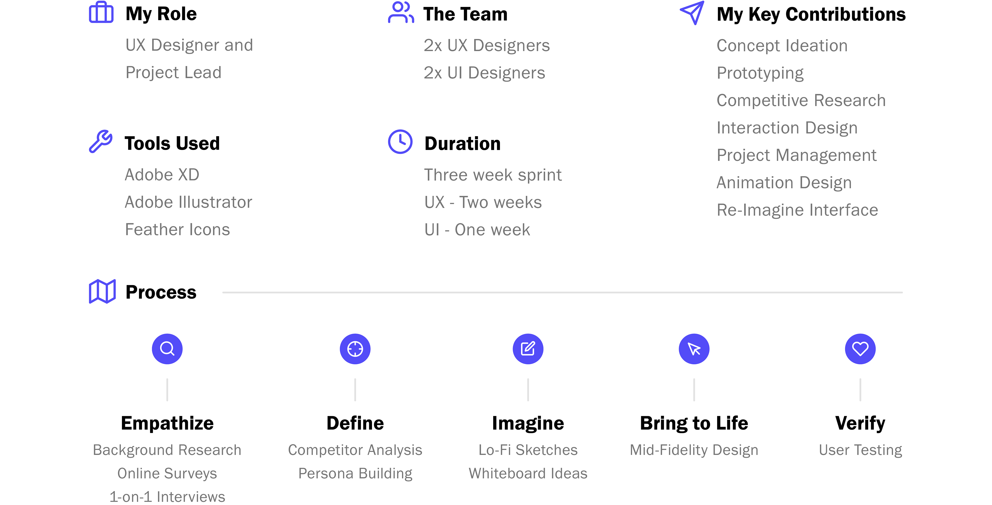
Sathish Bala OpenStage CEO
OpenStage
Sharing talent with the world
Our team was partnered with serial entrepreneur, Sathish Bala. Sathish started OpenStage as a showcase platform for new artists to be discovered and share their talents with the world. Leveraging his extensive background in the Toronto tech scene, Sathish had an idea to help artists finance their passion.
Our challenge
In an increasingly cashless society, gratuities that performers and musicians rely on are decreasing.
How might we facilitate cashless tipping for fans?
What success would look like
Project goals
After our first meeting with the CEO, we mapped out the main goals for the project.
Goal #1: A simple and seamless tipping method
Goal #2: Connect artists and fans through social media
Goal #3: Help artists become entrepreneurs
Goal #4: Create opportunities for artists to connect
Getting to know the players
User research and competitive analysis
In our first interview with the CEO he gave us an overview of the company, their why and the things they had been working on. To supplement and confirm the information provided, my UX counterpart and I gathered insights from artists, fans and the competition.

Insight #1
No download required
There was not always a requirement to download an application to tip, which was a practice we would be following with our design.
Result: The app would be for artists to share their unique identifier that would take tippers to a one-page application website.
Insight #2
How much is too much?
When presented with the concept of the app, artists were comfortable sharing up to 10% of their tip. This contrasted with our client's plan of collecting 30-40% of the artist's tip.
Result: The solution would come from the next insight below to collect an acceptable share collect an acceptable share within artist's expectations.
Insight #3
Fast paydays = Higher fees
Fees were not always required to withdraw money from similar apps, but if the money was needed quickly or on the same day there was a higher convenience fee.
Result: Using the same methodology I could balance business needs with artist expectations:
Scheduled Pay = 10% tip share to business
Unscheduled Pay = 30% tip share to business
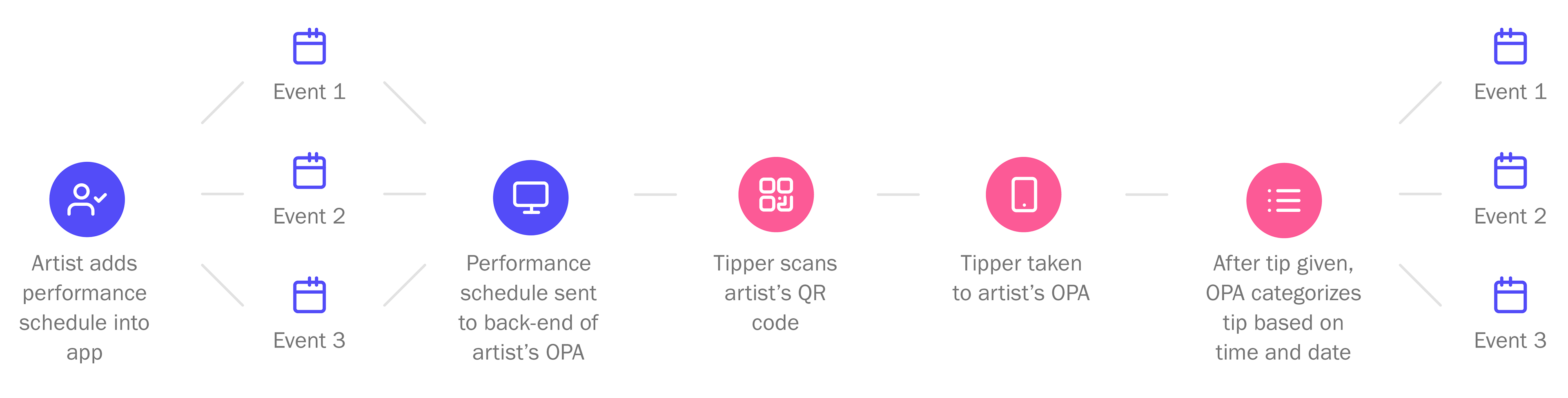
How would it work?
Back-end of tipping process
In the final stage of planning, we had to outline how the back-end of the app would work to get the tip to the artist. This process would be a main function of the app as designed by the CEO.
Bringing it all together
Design & prototype
With our goals, features and processes mapped we moved into the next phase of actually building the app starting with some rough sketches. I combined all the sketched screens onto one board so that were able to see and adjust user flows and navigation quickly.
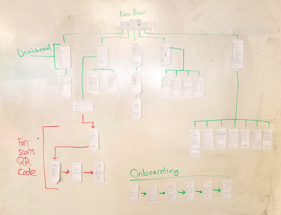
After this I took all of sketched screens into Adobe XD to bring them to life in mid-fidelity form. In each iteration, the app's functionality was streamlined to the point where assumptions could be tested and allow time to implement testing insights.
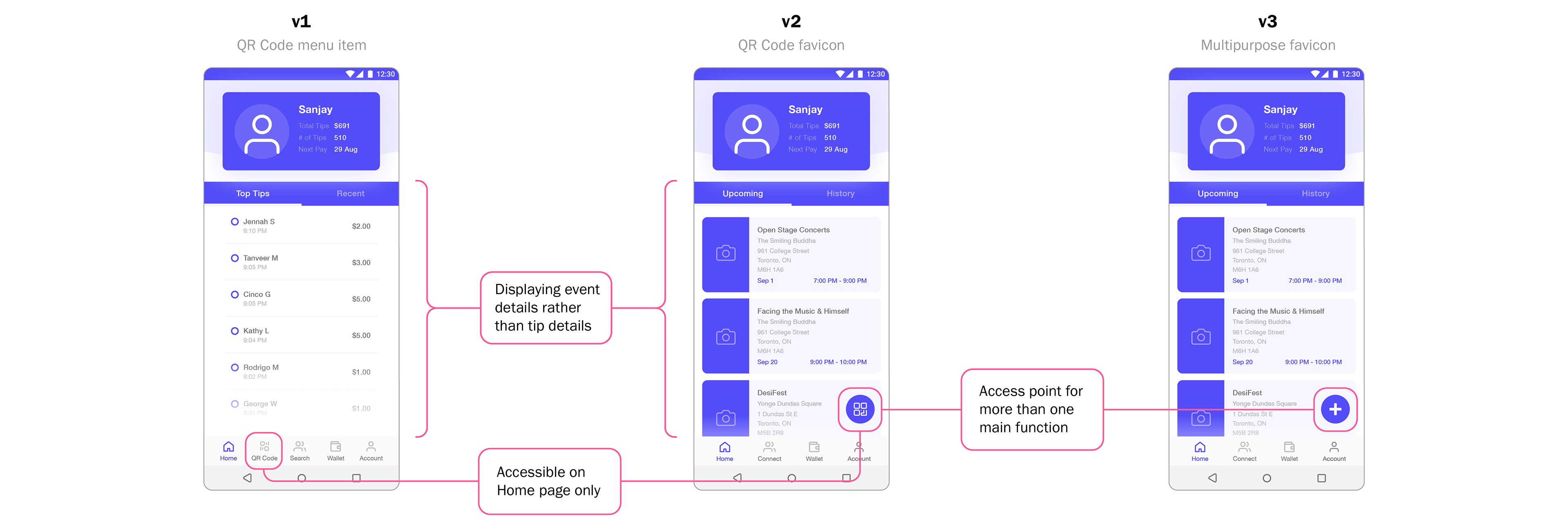
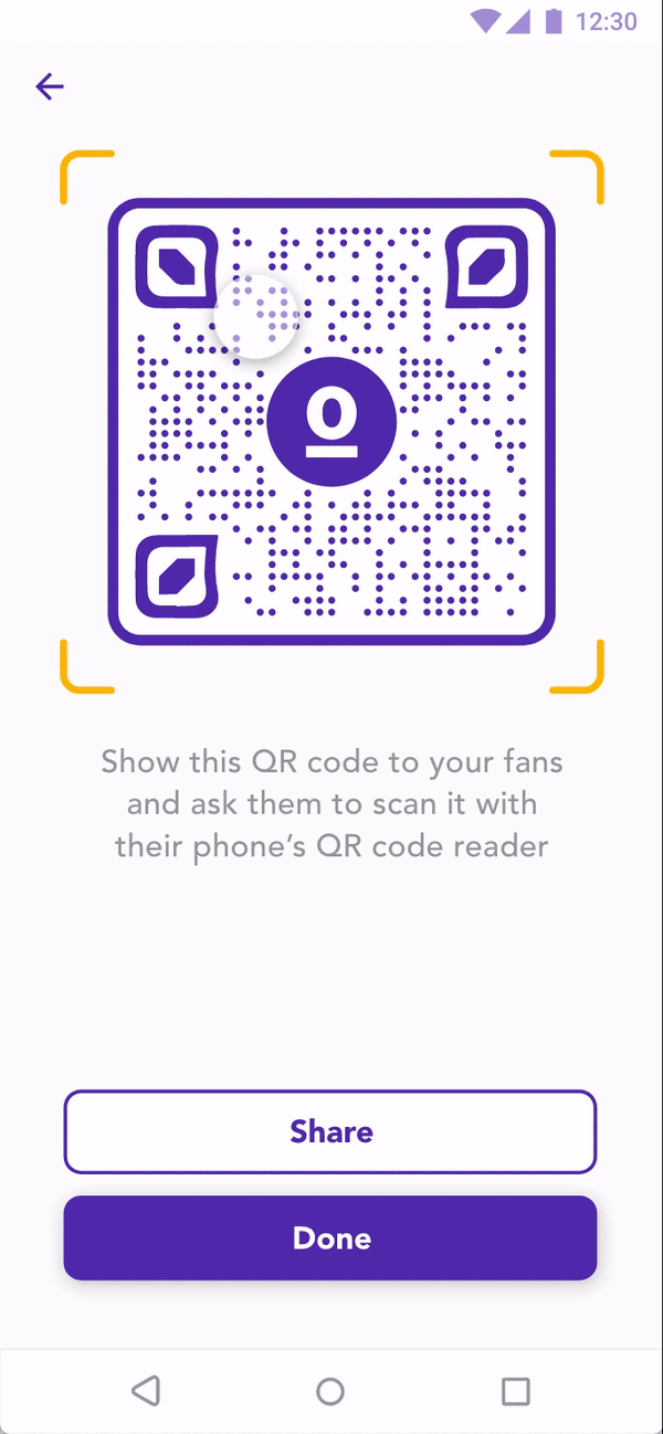
An example of the mid-fidelity's evolution can be seen in the design of the access point for the artist's QR code. Originally I thought the artist’s QR code should be in the main navigation for easy access from any page, but a new multi-functional favicon proved a better option.
Trying it out in the real world
User testing
Eight people were tested from the artist's perspective and from the perspective of a fan. Participants were able to find what they needed easily and found that the process that a fan would go through for tipping was simple and straightforward.
There were two main adjustments needed:
Change #1 - Artists
How much did I make?
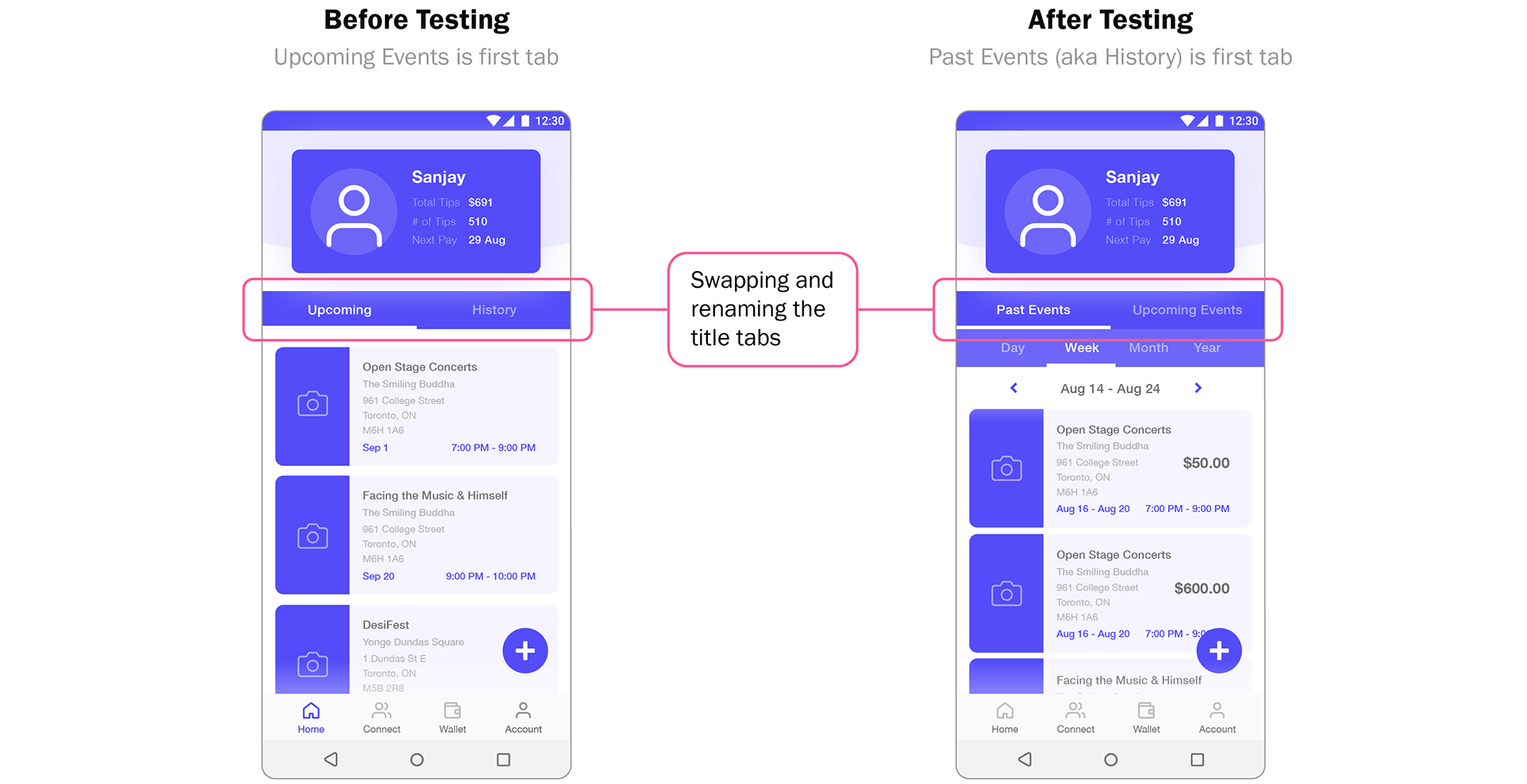
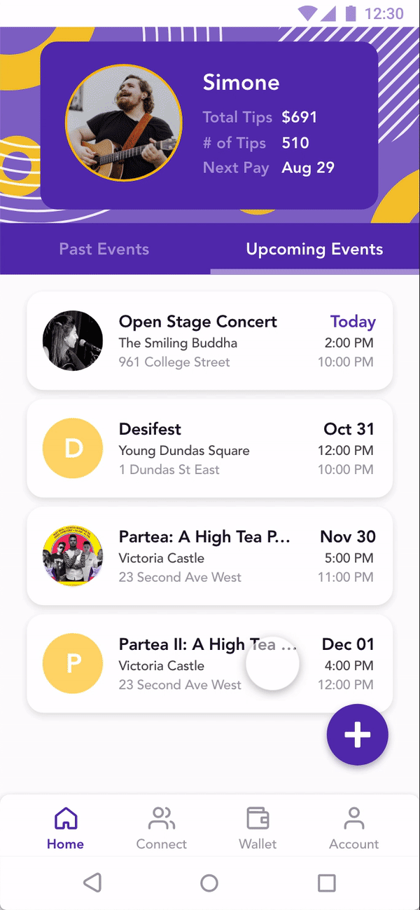
Artists were more interested in how much money they had made at a previous event than which events they had upcoming. As a result, the tab order was re-arranged to make Past Events (aka History) the first item the artist would see.
Change #2 - Artists
Providing more context
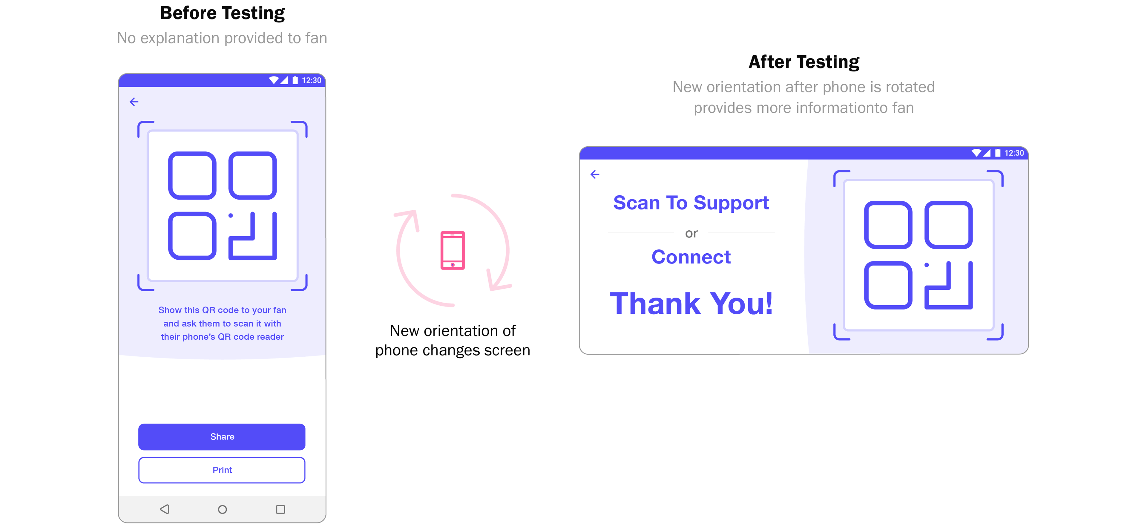
After rotating their phone the artist's screen would change to provide more information about the QR code as well as a prompt for the fan. Before testing this was not an option.
Polishing a gem
High fidelity designs
After implementing the changes, the files were handed over to the UI team.
Note: After the project ended, I refined the UI to have an added sense of openness and fun through the use of complementary colours and illustrations. I chose illustrations because they were easier to align to the colour palette and they contributed to the fun feeling more than photographs would have.
Bringing the whole project to life
Interaction design
After the UI team gave our mid-fidelity prototype a facelift I animated the prototype so that it was a closer reflection of how our users would use the app.
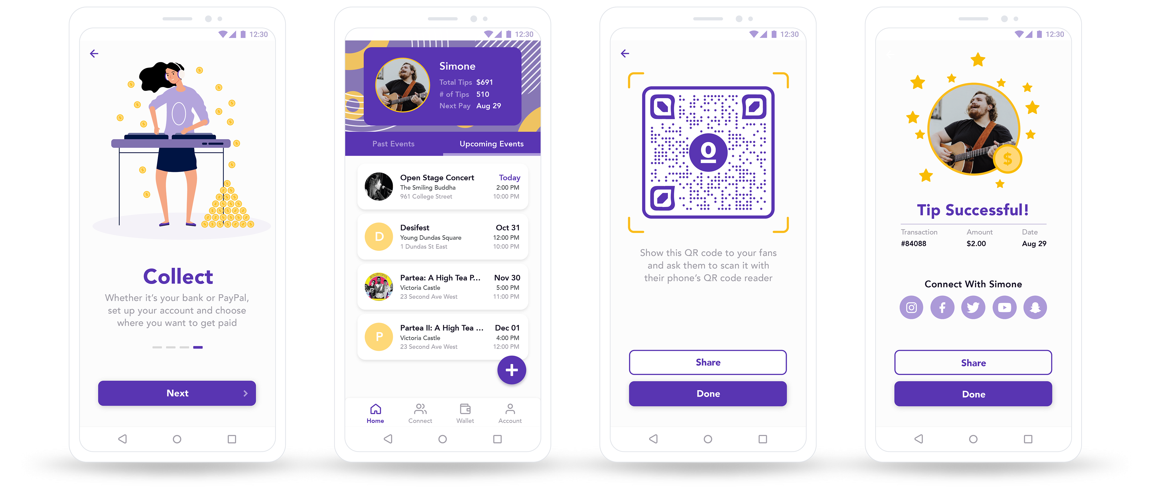
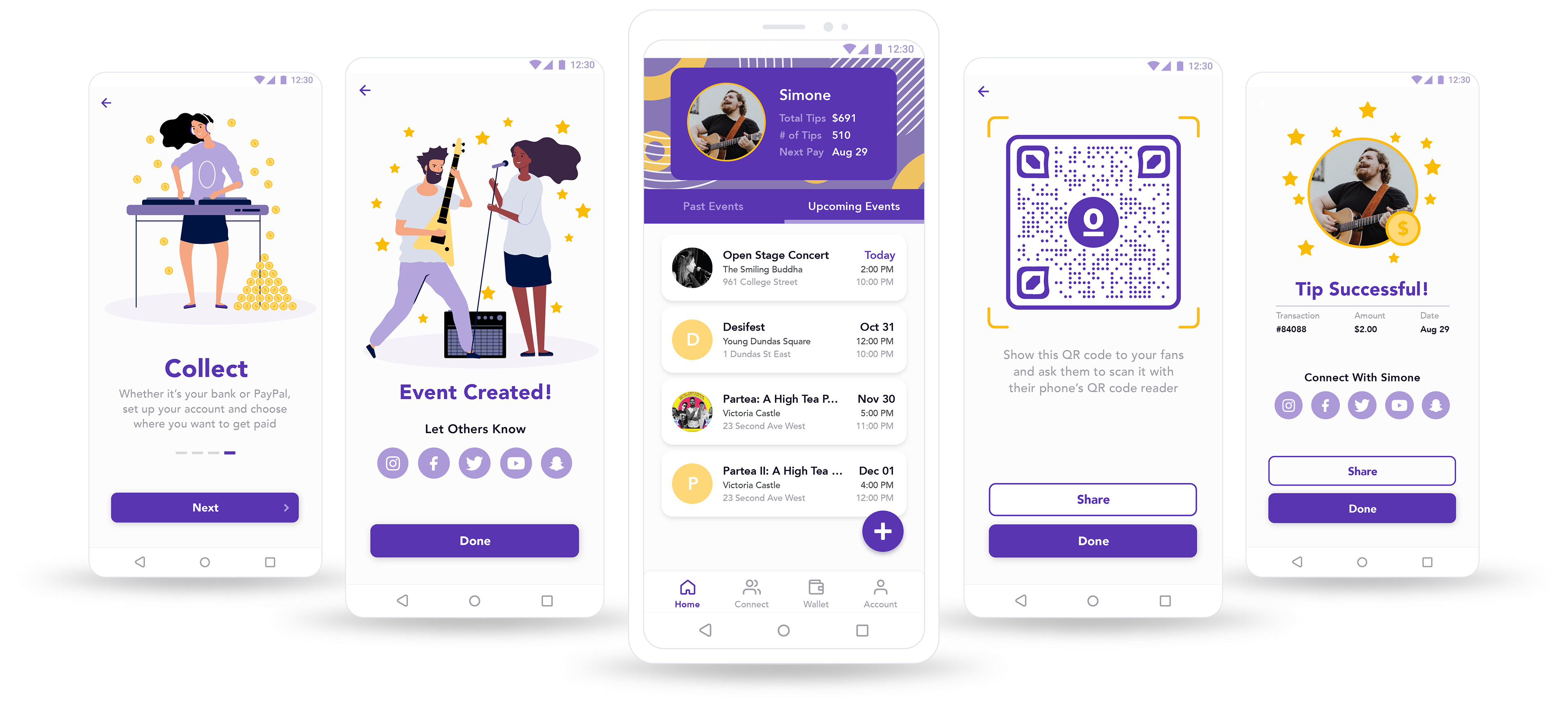
The artist
Creating a new event
Simple form fields to complete to make the event creation process fast and seamless.
A Missed Opportunity: Thinking back, there was no functionality built into the app to save or re-use previously created events. Left as is, it would have been very bothersome to repeatedly enter the same details when creating similar events.
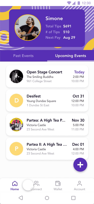
The artist
Sharing QR code with fans
Immediate access to the artist's QR code to share and accept tips at a moment's notice.
Planning for the Future: In our first meetings with the CEO, he had a lot of future ideas to expand the functionality of the app so I thought this favicon design offered a lot of flexibility for future functionality.
The Fan
Supporting + connecting
After scanning the artist's QR code, the fan will be taken to the artist's one page application. Even if the fan doesn't tip, they can still support the artist by following the artist's social media account.
A Tad Optimistic: Looking back, I was a tad optimistic thinking that people wouldn't think twice about entering their financial details into a random website. I should have built an intro screen explaining the options rather than the first screen saying "How much would you like to tip?". This might have established more trust at the beginning.
Final thoughts
My most valuable MLP (minimum lovable product)
As a team, we were really proud of the app we’d created in just a few weeks. Personally, it was the most comprehensive UX design (75 screens) I've created in such a short time span.
The cherry on top was that our client took the prototype to be developed in Brazil.
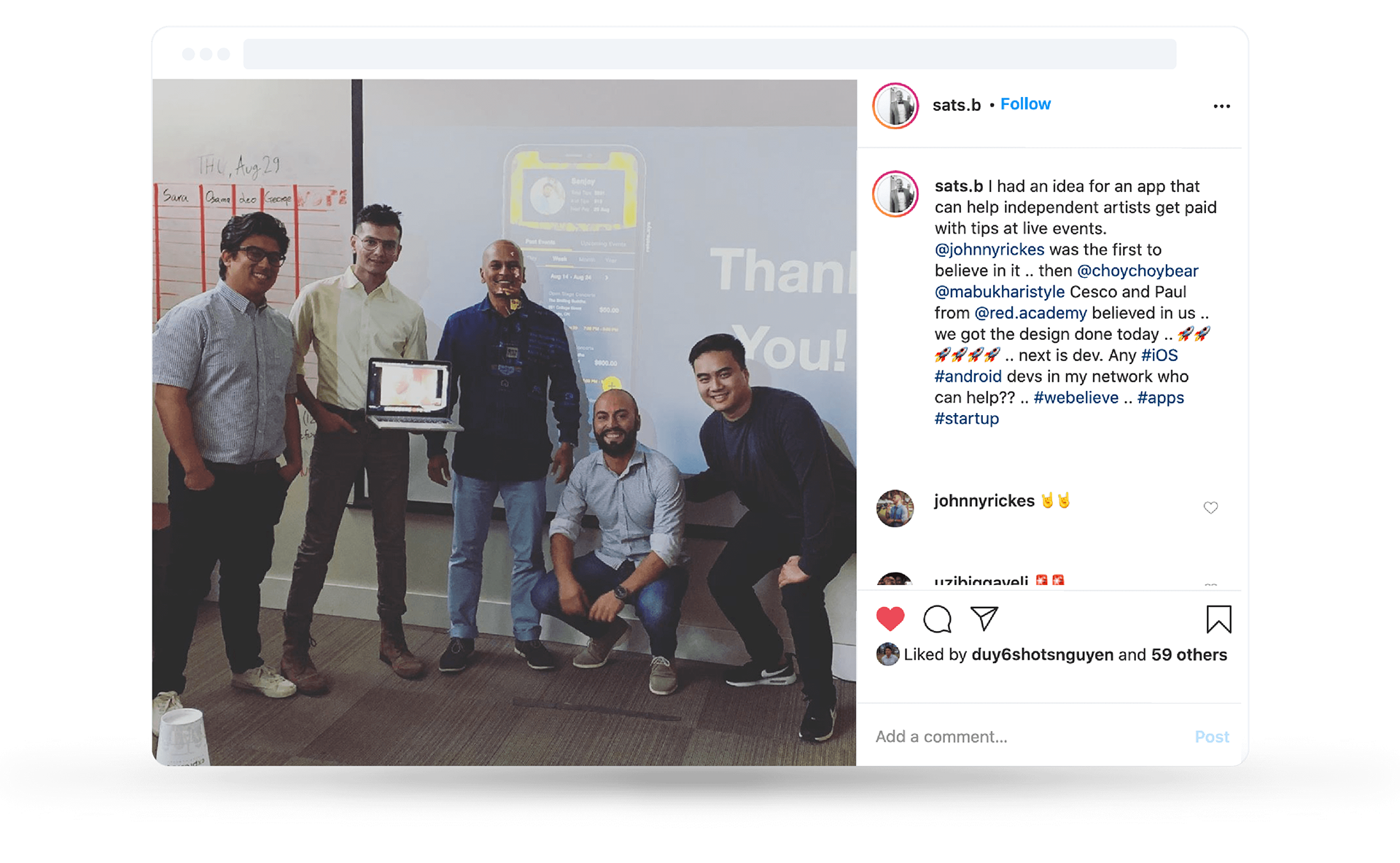

"I'm very excited about what you brought to the table. Great visual, smooth and stylish. Congratulations and thank you for everything!"
Johnny Rickes, App Co-Founder
Feedback on the design? Want to chat over coffee about building an app from scratch? Feel free to get in touch or schedule a chat.