Main Street Brewing
The main thing is the beer—Nestled in the popular Vancouver community of Main Street is the aptly named Main Street Brewing. A brewery, tasting room and retail store are all neatly tucked into a historic old brewery building and each section is stocked with hoppy temptations.
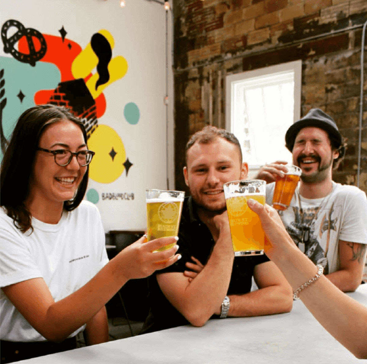
Photo Credit: Main Street Beer
The Hop'ortunity
To encourage the refilling of growlers (re-usable beer containers) at their brewery, they had created a program that rewards customers for refilling their growlers. This program was called the Growler Loyalty Program.
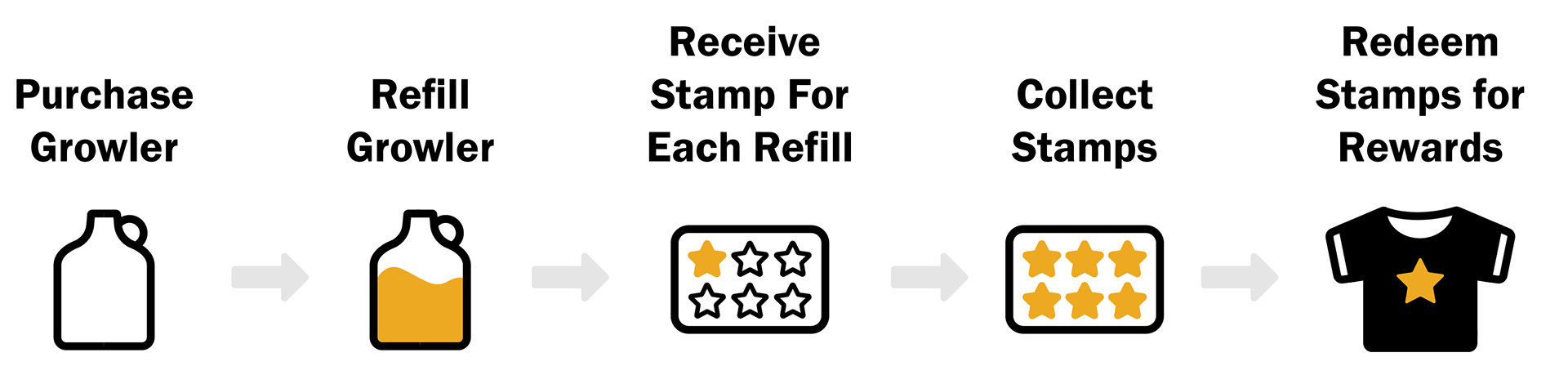
The program became very popular and, as a result, the brewery had 1,500+ physical loyalty stamp cards filed in alphabetical order on their countertops. This made the reward tracking process cumbersome for both employees and customers. Our team's project would be to digitize the Growler Loyalty Program.
Our problem
The client already had a well-established brand and numerous sub-brands as well.
How might we design an interface that is unique, but still connects to the overall brand AND is flexible enough to work with numerous sub-brands?
Getting orientated
After our first meeting with the founders, my UI design partner and I dove headfirst into the brand of Main Street Brewing to gather insights and a better understanding of the company as a whole.
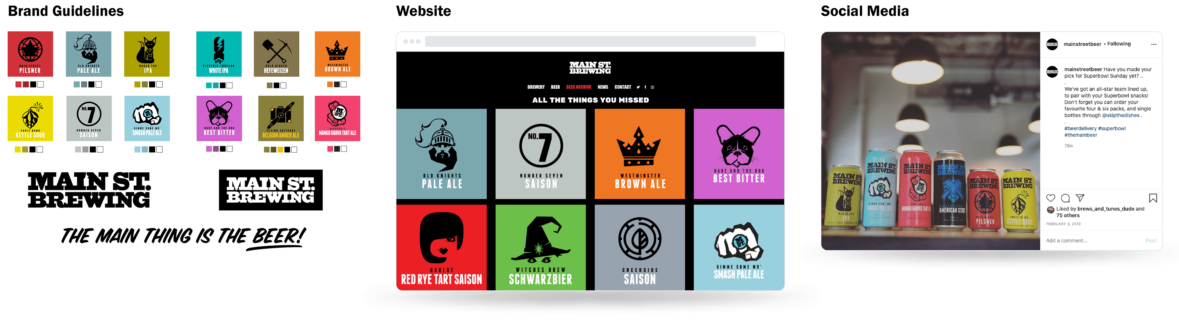
Our client had very detailed brand guidelines along with guides on how the sub-brand of each beer logo should be displayed. The website was designed to make the beer logos the most prominent elements and the purpose of this design was aligned with the company’s slogan of:

From the client’s social media presence it was easy to ascertain that the brand’s tone was playful, inviting and helpful. Like the website, the majority of social media posts were putting the beer front and center.
The start of something great
After sharing my findings with my team and confirming them with the founders, I began dismantling brand elements to create new combinations.
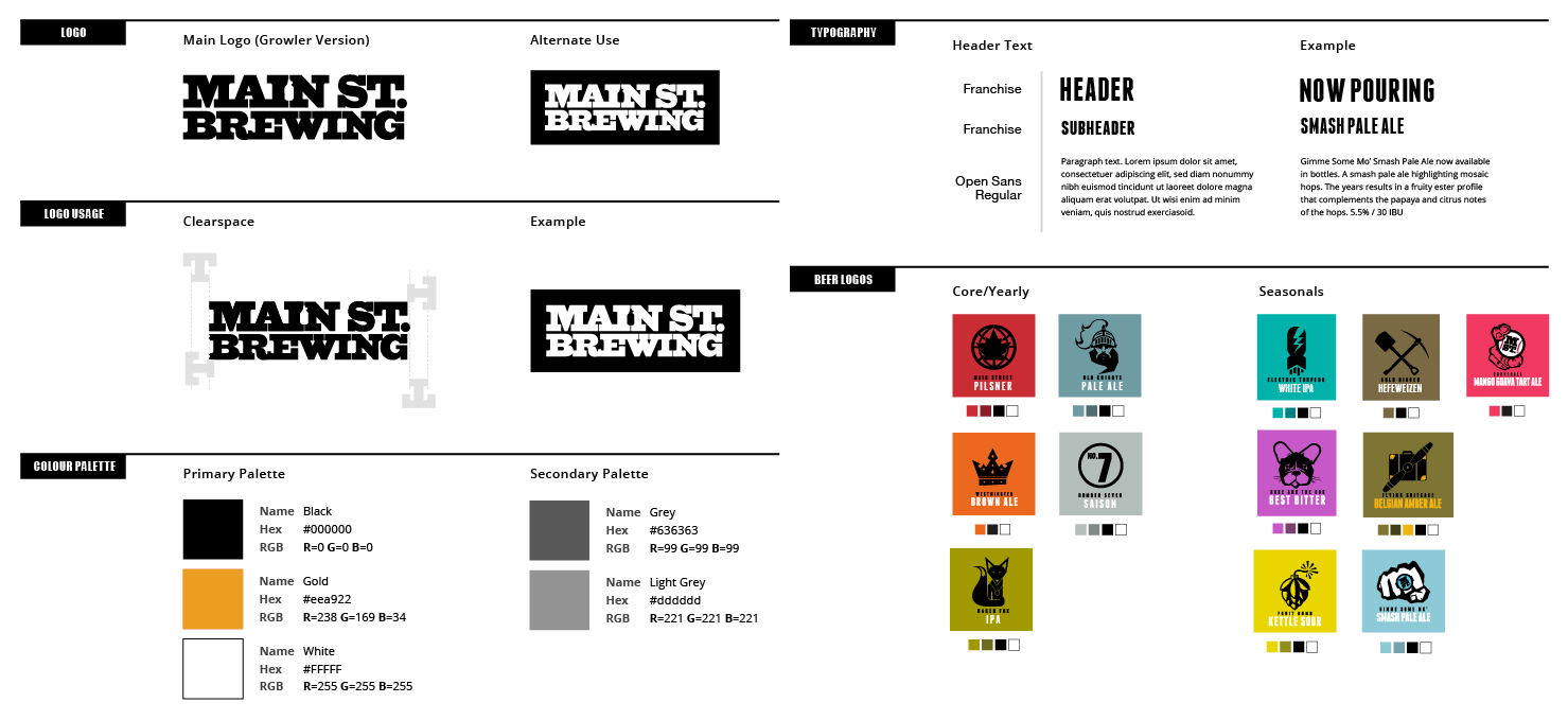
The first brand element I established from this method was the icon for the app. With this icon as a reference point, I determined that the UI would be mostly black and white while the highlight colour would be gold. Gold was chosen as the main highlight colour since it matched a theme of “loyalty” and “reward”.

Establishing our own guide
A finalizing the logo/icon my partner and I developed the overall style guide for the app. We used the same typefaces as the brewery's website to ensure that the app connected with the overall brand.
Playing within the lines
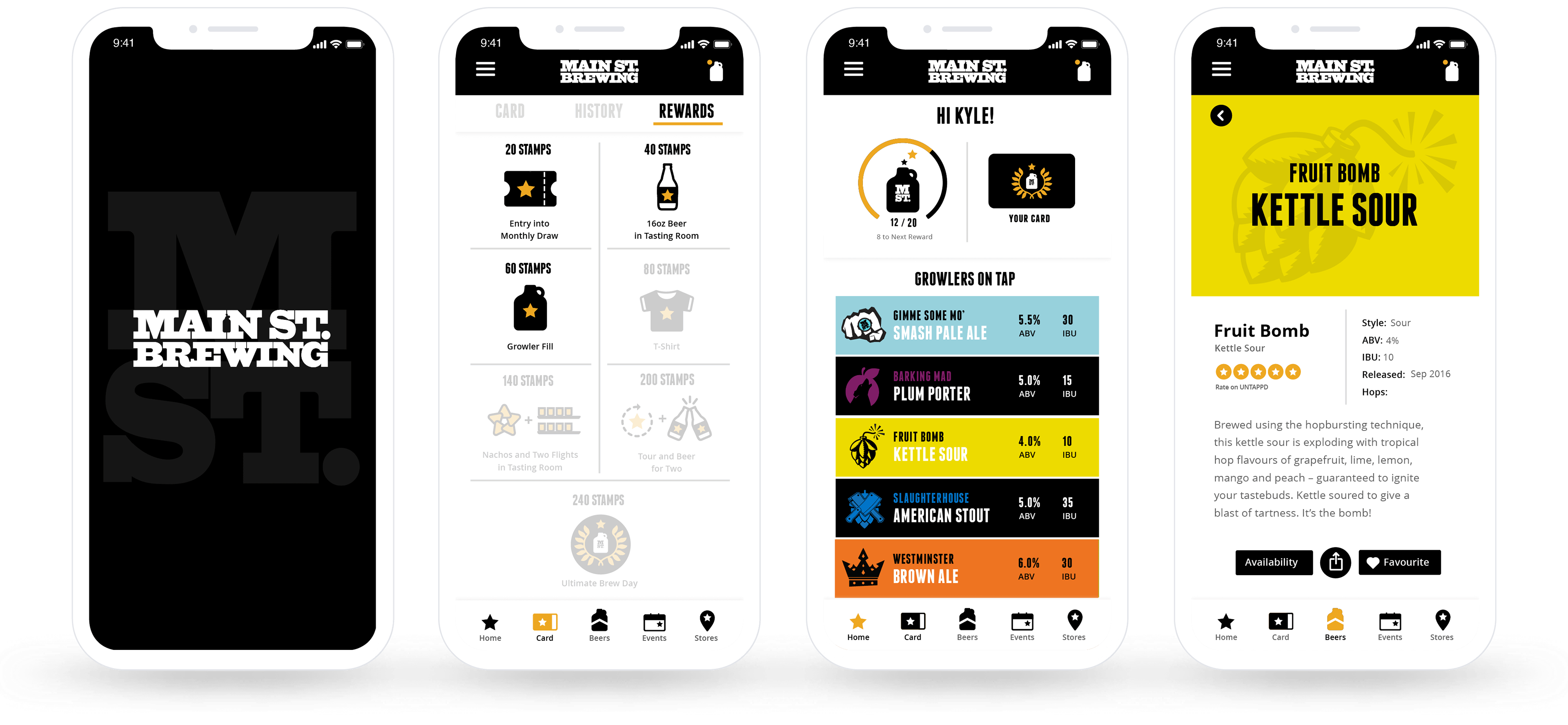
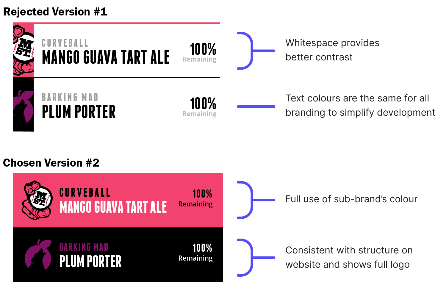
A component that took a lot of time was the card structure of the beer sub-brands.
After consulting my UX team, I decided that a minimal approach would be ideal. Our client though felt that the minimal approach of Version #1 did not showcase the sub-brand enough. They preferred Version #2 which was more in-line with their current digital products.
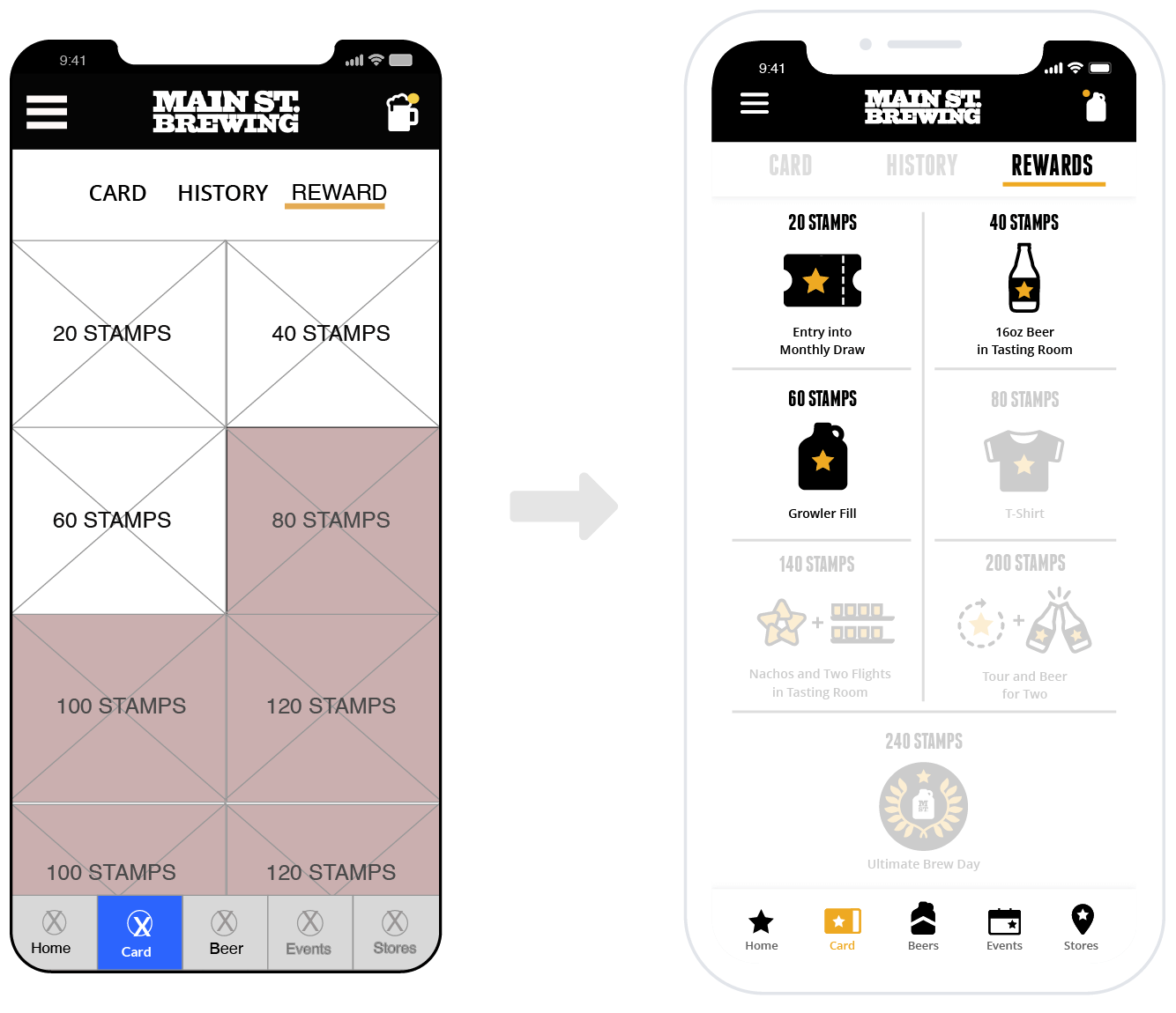
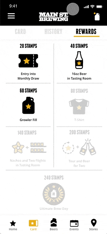
With that settled, the next design element I created was a set of custom icons. I felt the icons were necessary to provide an on-brand delightful representations of the unique prizes.

Can you guess which icon is "Nachos and two flights?"
A fresh coat of paint
Our fantastic UX counterparts were very much on schedule and this allowed my UI partner and I time to experiment. At first, I thought the app should have a dark theme similar to the way the website was designed.

This first experiment failed though because the white was overpowering the yellow highlight and competing with the beer sub-brand's colours. As a result, the dark theme was only used for the onboarding experience.
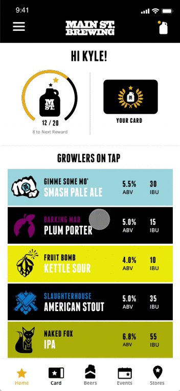
After the onboarding screens, the app opens up to a clean and minimal look to ensure that "The main thing is the beer".

After that was settled it was time to add our new UI to the UX wireframes our UX counterparts had crafted.

Bringing the design to life
After cleaning up the hi-fi's I decided to animate the prototype using Principle. I wanted to add more 'wow' factor to our pitch and give our client a better idea of how the app would work.
Leveraging familiarity
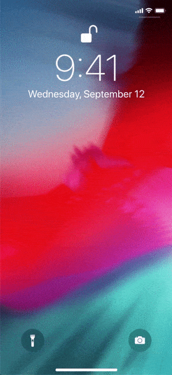
Onboarding experience—The transition from a black background in the onboarding experience to a white background in the app was meant to give a feeling of "getting in".
The black background of the onboarding was also an ideal connection to the brewery's main brand. As a result, users familiar with the brewery's brand would feel right at home.
The beer is always the main thing
App interactions—The beers are a central element catching the user's eye throughout the app and when they aren't, everything else is out of focus so the user knows exactly what they need to do before getting back to the beer.
Since there were eight beers available for growler refills, I built an animation that moved everything out of the way so the user can see all of the beers at once.
Getting the good stuff
Reward redemption—Since all rewards are physical items, the customer would need to scan their card and pick up their reward in-store.
Looking back, this process could have been clearer to customers with an indication of current number of stamps versus the number of stamps to be redeemed.
Encouraging engagement
Location based notifications—The app presented an ideal opportunity to inform customers about special tasting room promotions, limited beer releases and upcoming events.
Providing helpful information to customers through the app was absolutely ideal for encouraging engagement, increase user retention and promoting sales.
Final thoughts
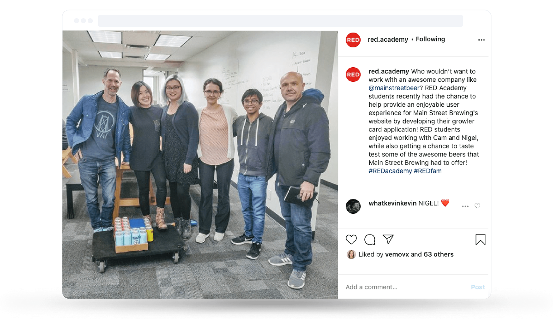
Many proud moments—The final pitch to our clients was a packed house, including all RED Academy students and staff. Our clients were exuberant after seeing the prototypes and especially pleased with the way we had stayed true to their branding. They also thanked our team handsomely with a cart of their finest brews.
The prototype was also chosen to be developed by the App Development students. As a result, I had the opportunity to manage the hand-off and collaborated with the developers to bring the project to life.

Absolutely love it. I'm speechless. It's on-brand but completely new. The deep thought and detail you all went into is really amazing.
Cam McGowan, Co-Founder
If you've made it all the way to the end, you're a special one. Thanks for taking the time.
Interested in learning more? Here are a few ways to dive deeper.
About me / My resume / Linkedin / Schedule a chat