The Opportunity
In order to start selling his private label products on Amazon this entrepreneur needed a logo that he could trademark and register. The name of the business Hokena was inspired after his visit to a Hawaiian beach called Ho'Okena.
Looking at Options
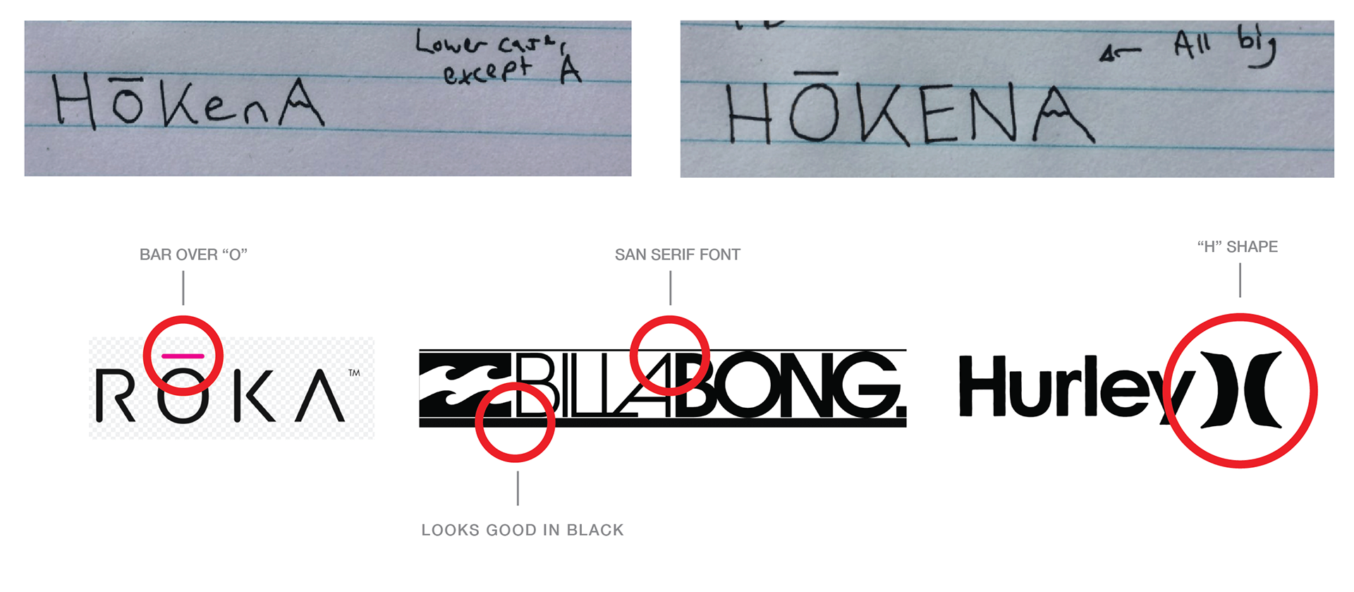
After a long discussion the conclusion was that the logo would be simple, literal and approachable. Because the logo would be on the package of the product it was crucial that the logo look good in black and have a very simple defined structure.
First Drafts
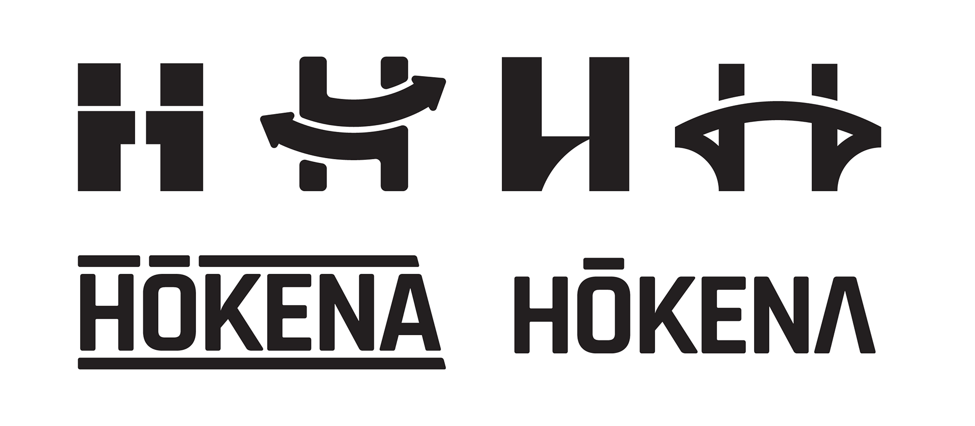
After the first round there there wasn't a clear winner, but the client did indicate that they preferred the typeface used in the logo that was text-only. As a result I prepared an entire round of logos to expand the option of the text-only logo with the approachable typeface called Rajdhani (Heavy).
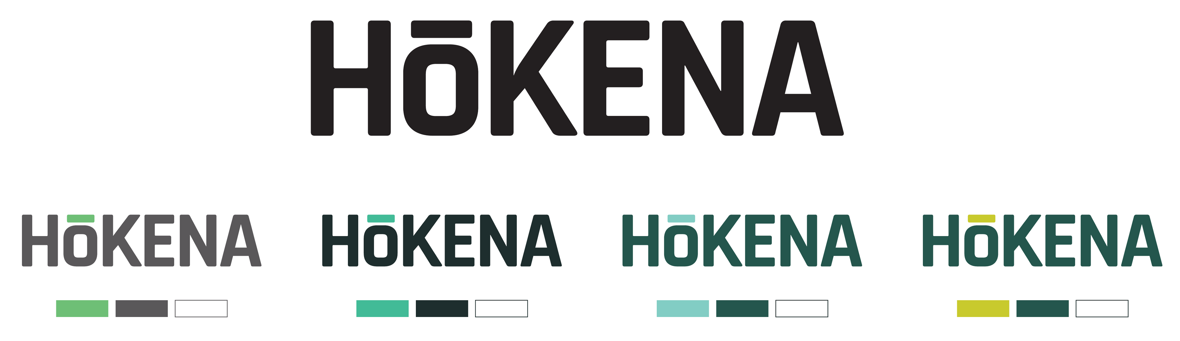
The next round yielded an enthusiastic response and from there we were able to try a few colour iterations.
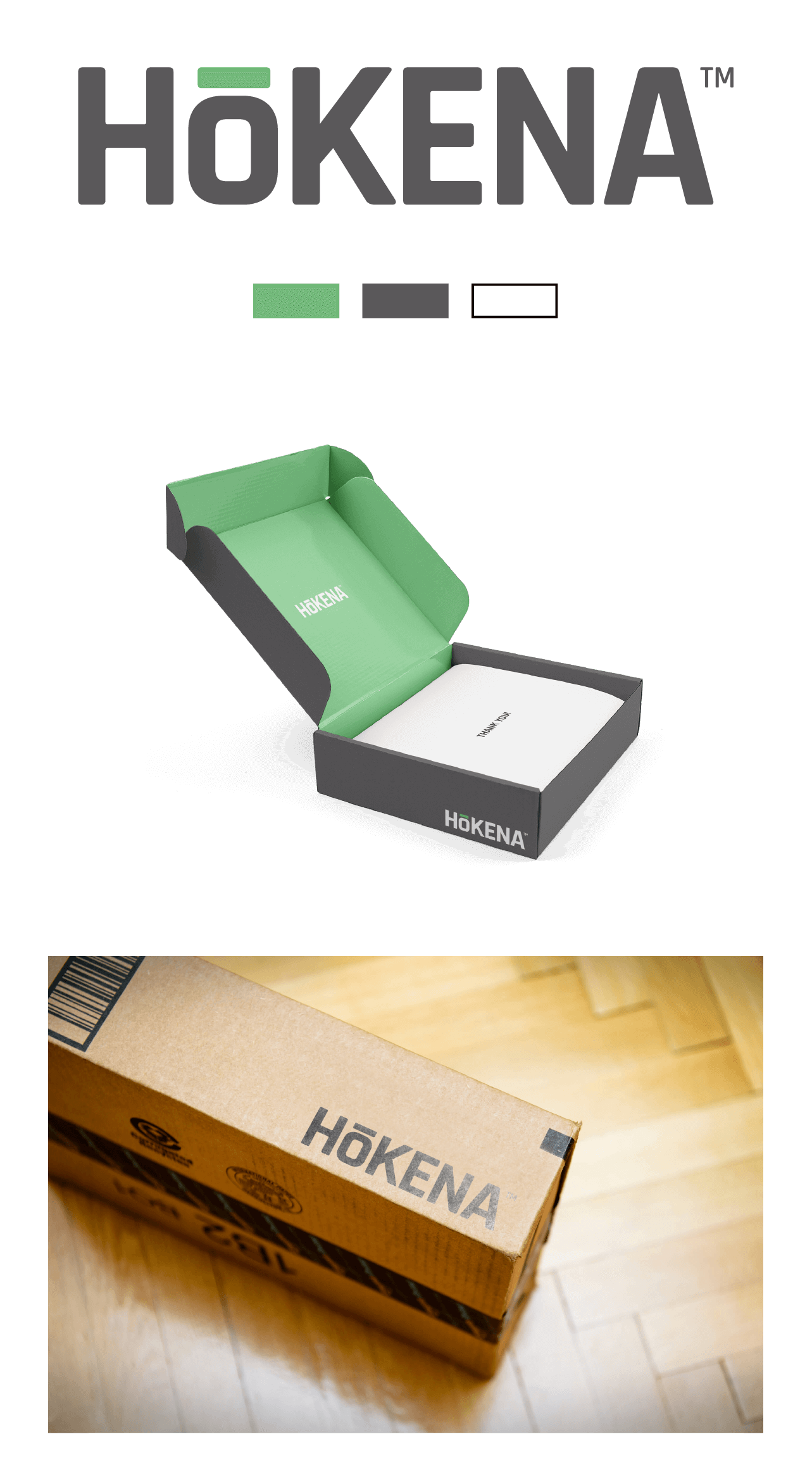
The Final Decision
After a quick look it was immediately clear which direction we would be going and after adding a TM icon to the logo the identity was complete.