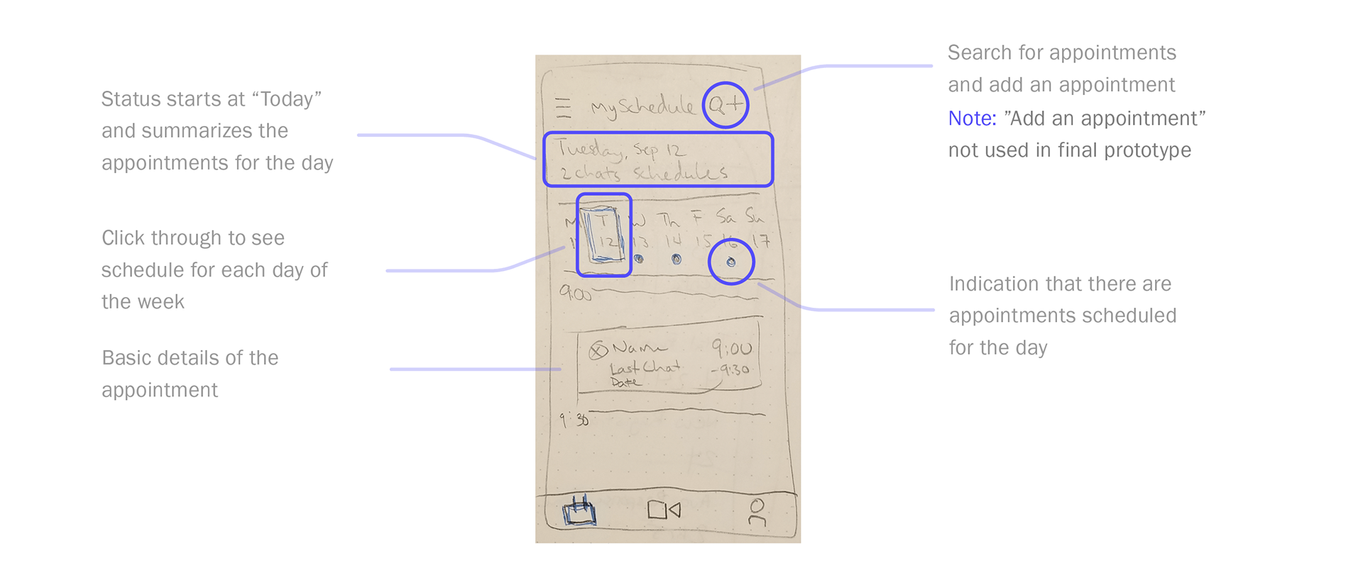
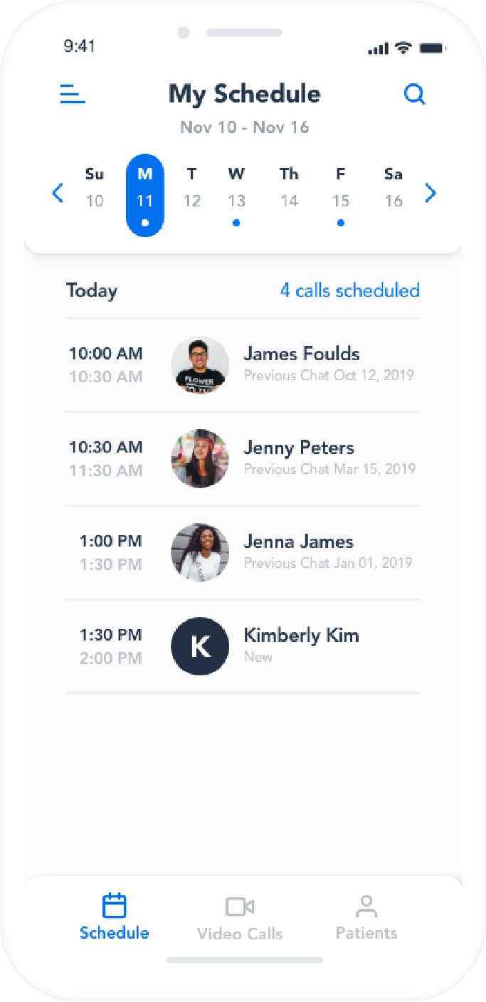
App Screen #1
Doctor's Weekly Schedule
This screen would be where a Doctor could quickly reference their schedule for the day and the rest of their work week. With their busy schedule, it would be important to make the information very ‘scan-friendly’.
App Screen #2
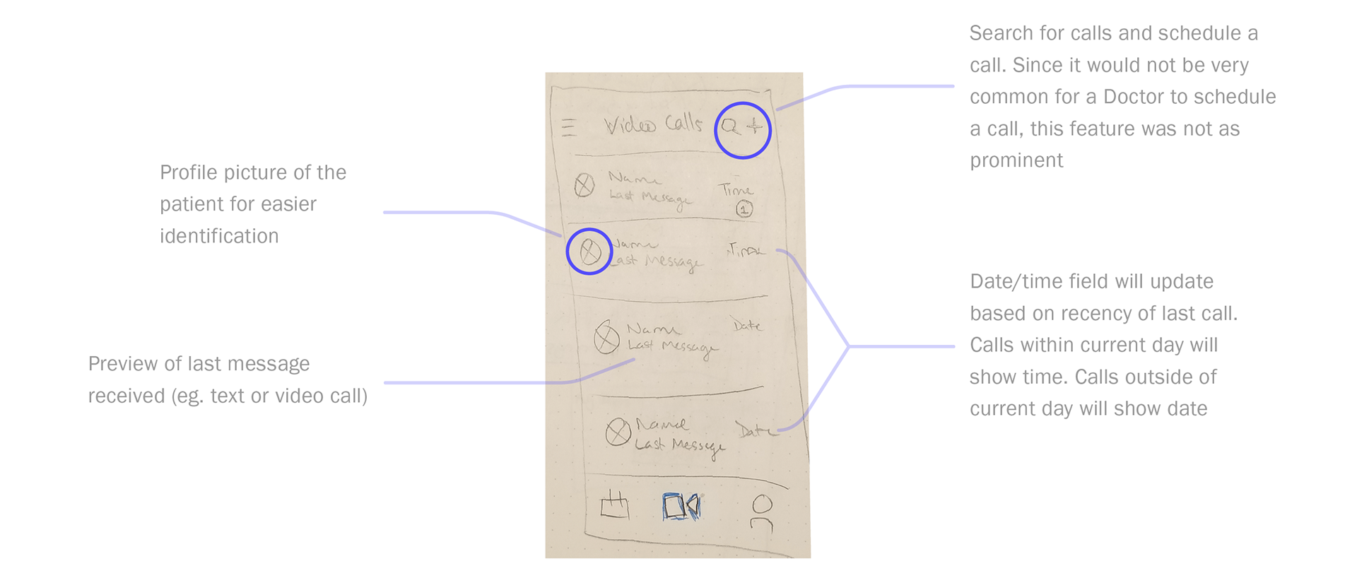
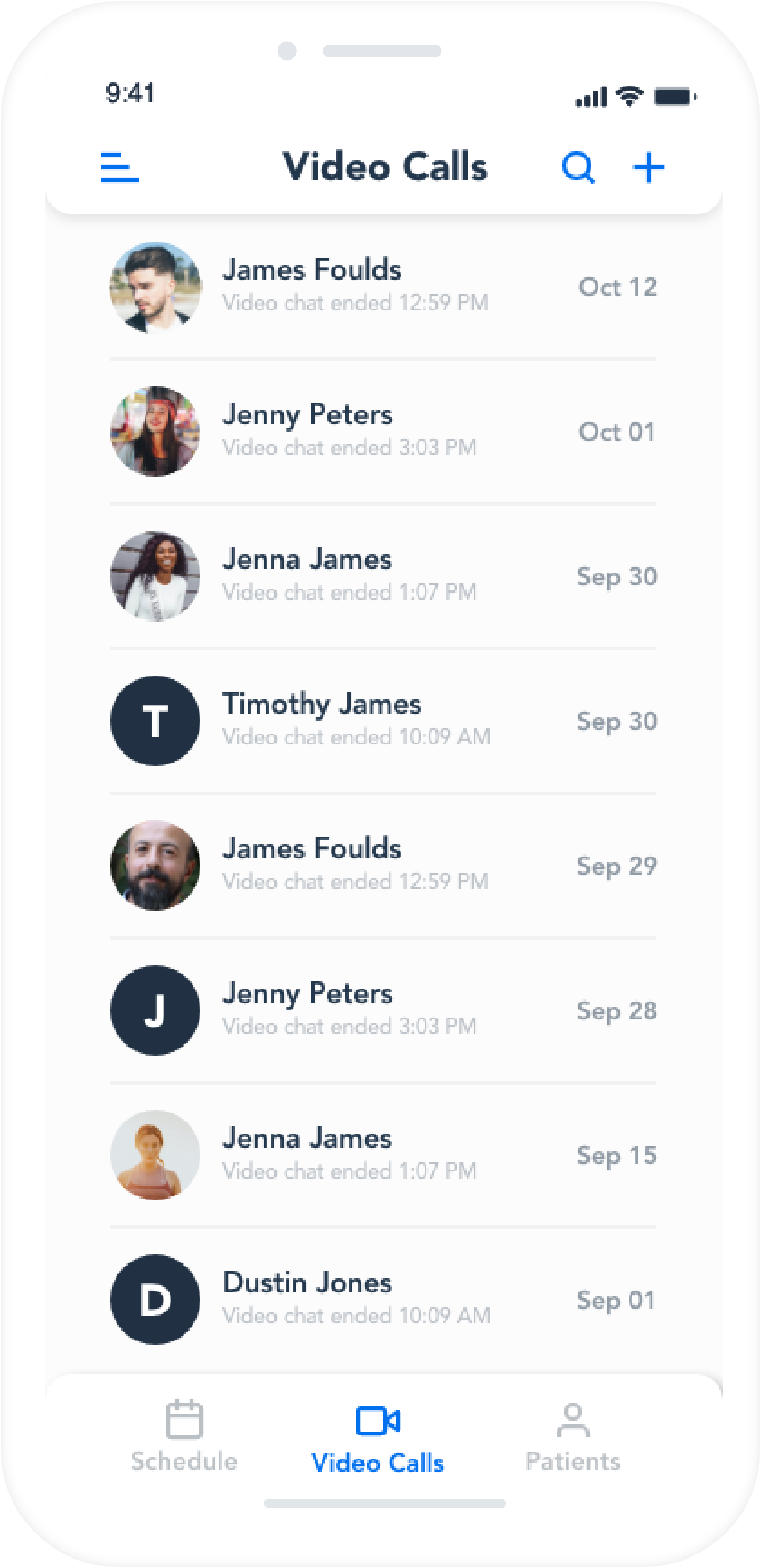
Doctor's Video Call
On this screen would be a simple listing of all the video calls that a Doctor had completed as well as an easy reference to see a history of previous video calls. The Doctor would also have the ability to search for a previous video call and schedule a call if required.
App Screen #3
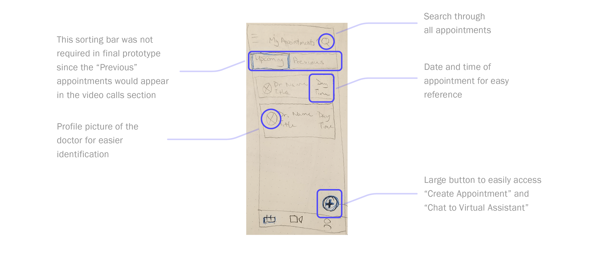
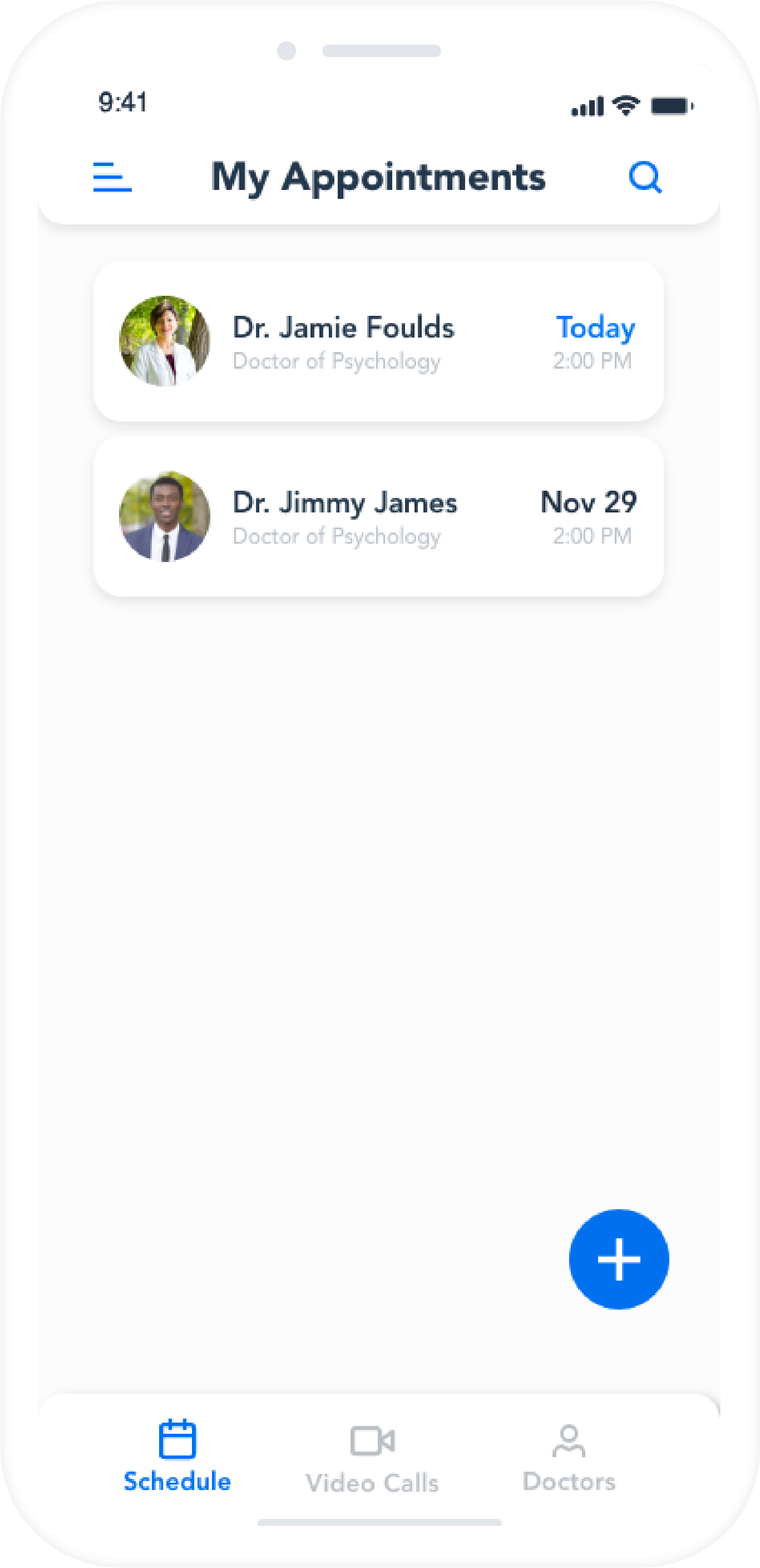
Patient's Video Call
This screen for the patient would allow them to easy sort through the appointments they had scheduled as well as the ability to create another appointment or talk with a virtual advisor.
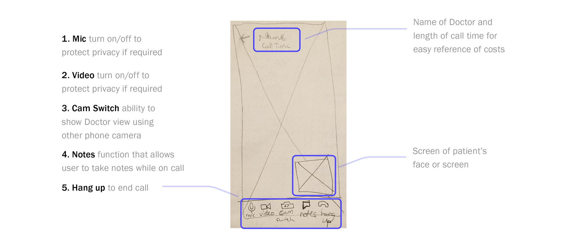
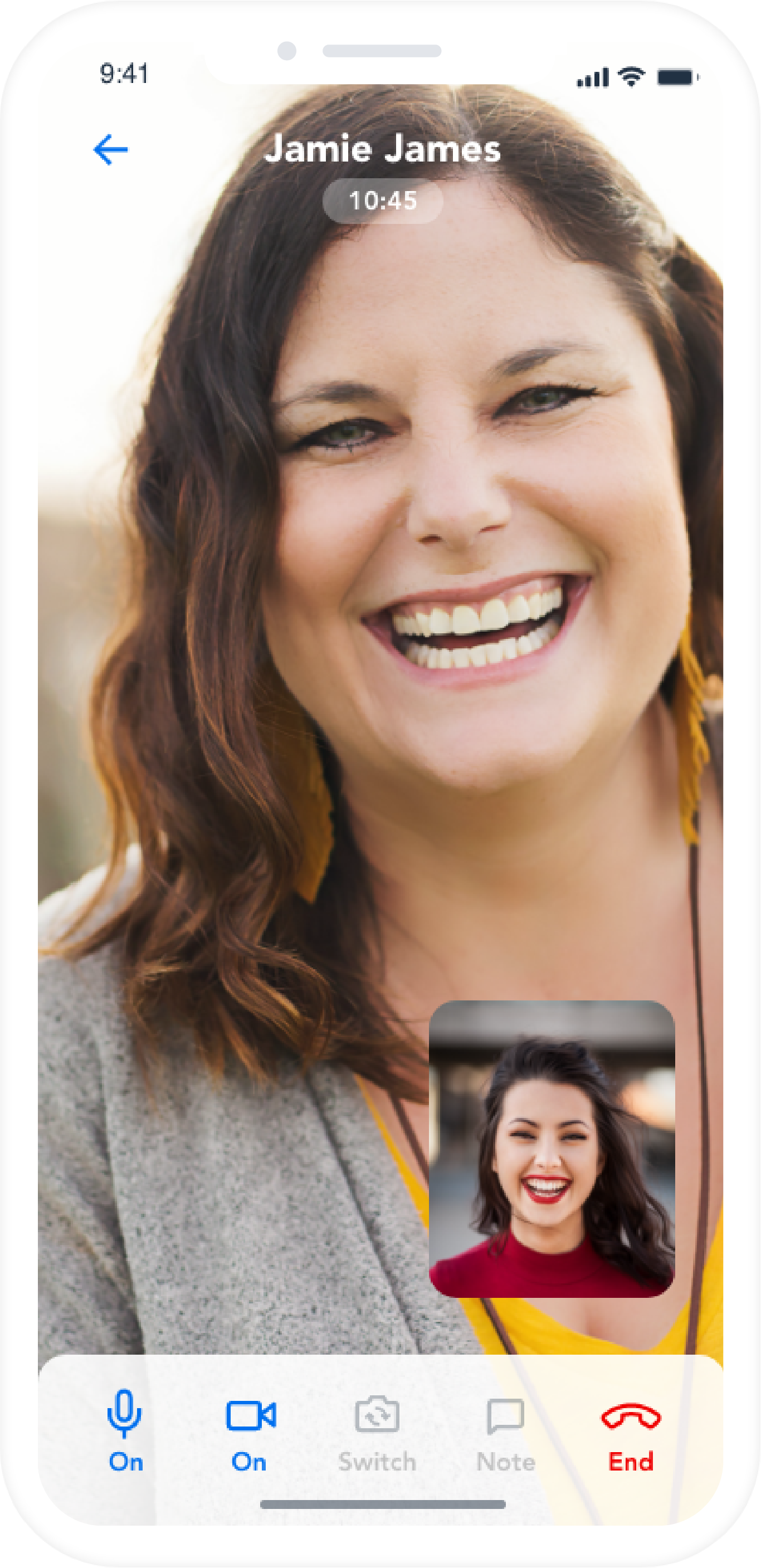
App Screen #4
Patient on Video Call
When chatting with the Doctor the Patient would need quick and easy reference to tools that gave them the anonymity they may want when speaking with a Doctor. There would also need to be quick reference to see how long a call had been going.
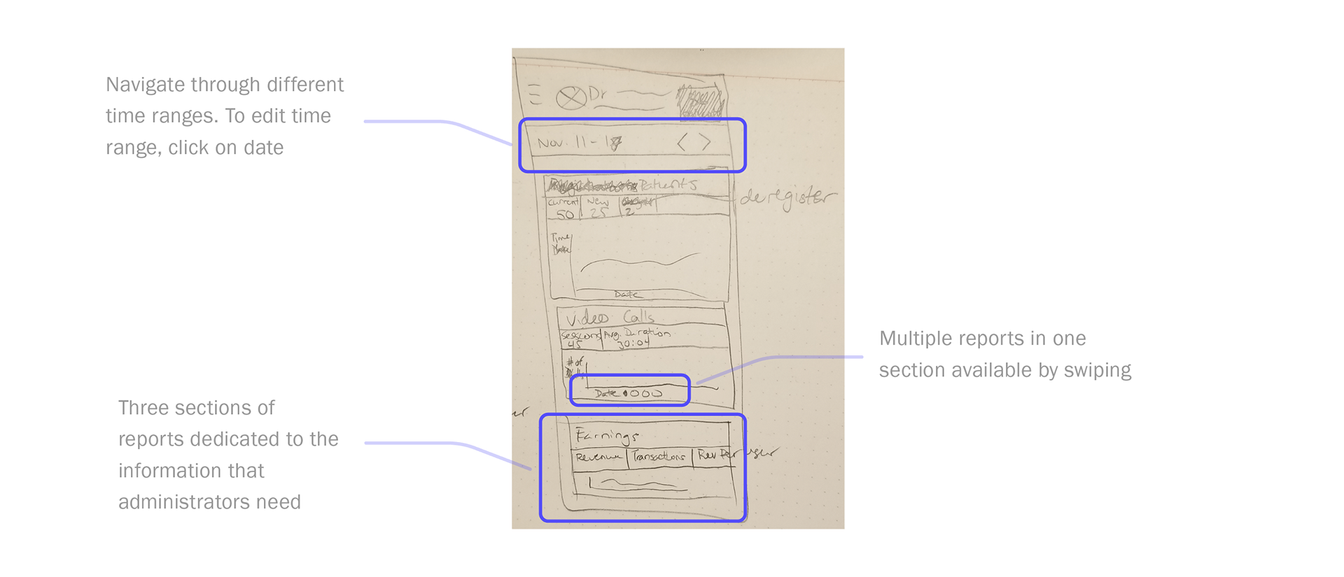
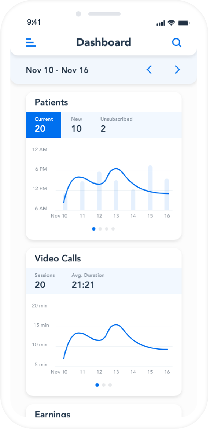
App Screen #5
Administrator Reports
There would need to be a number of reports available to an Administrator so that they could easily find the information they needed. Reports would be grouped together based on their relation and be swipe-able to see the variety of reports under a title.
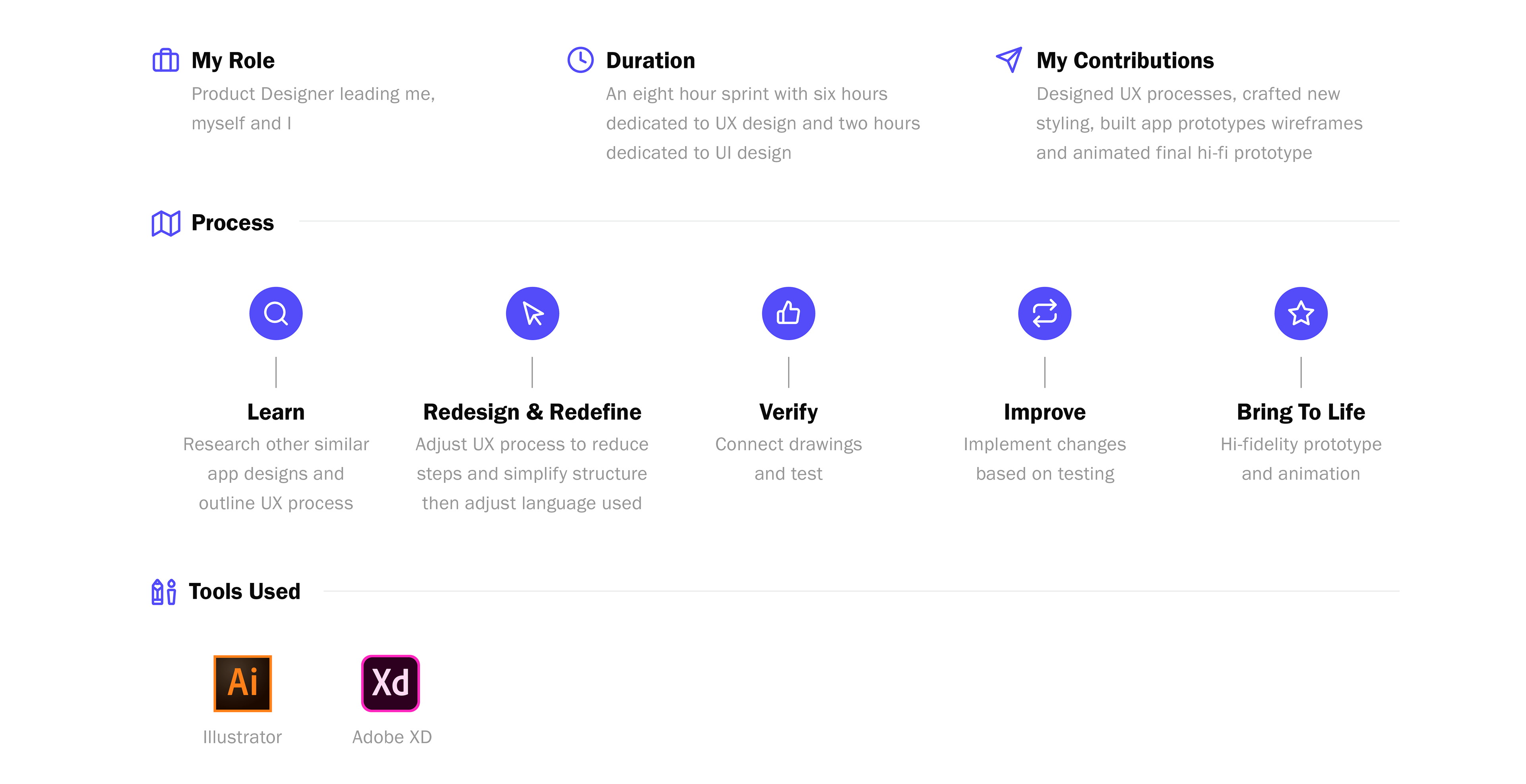
Bringing the Designs to Life
App Screen Animation
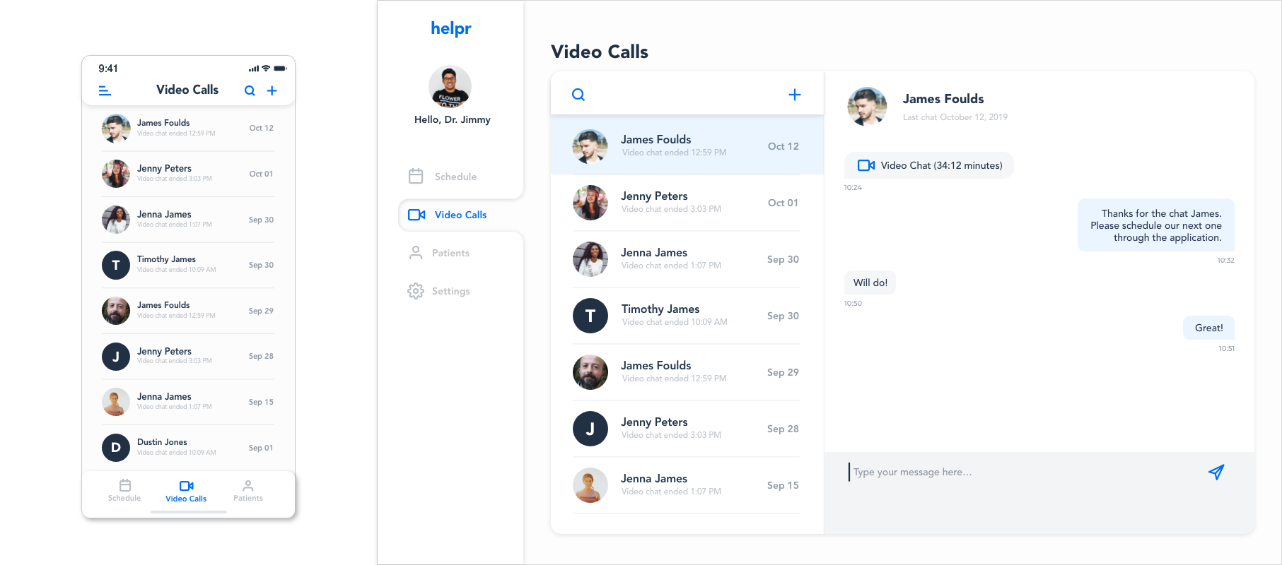
Web Screen #1
Doctor's Video Calls
On this screen would be a simple listing of all the video calls that a Doctor had completed as well as an easy reference to see a history of previous video calls. The Doctor would also have the ability to search for a previous video call and schedule a call if required.
A dashboard format was used for the web-app portion so that all the pages were easily accessible and no pages had to be hidden away in a hamburger menu. This format also allowed the chat/video calls history window to live in the same screen as the video calls window.
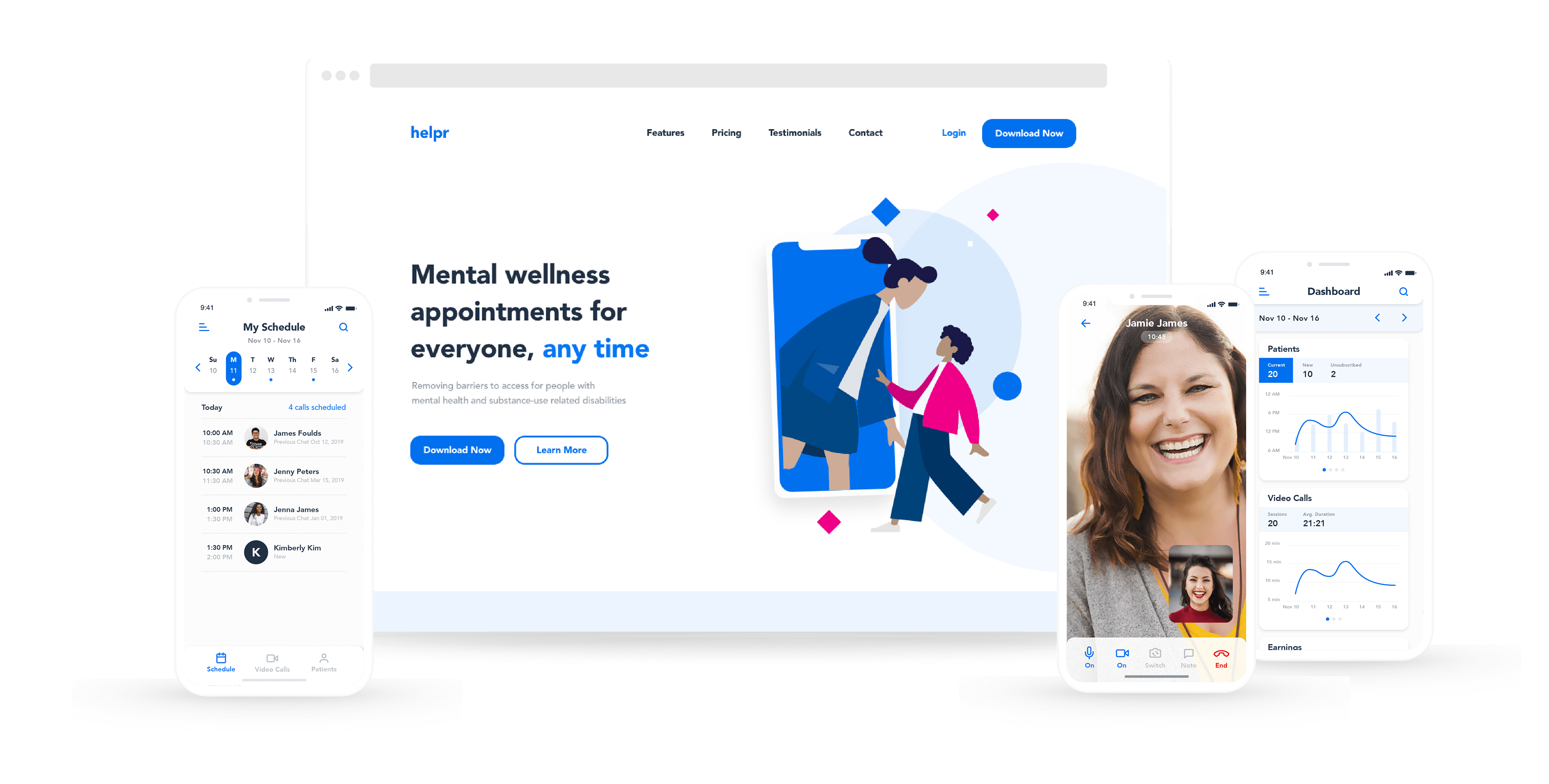
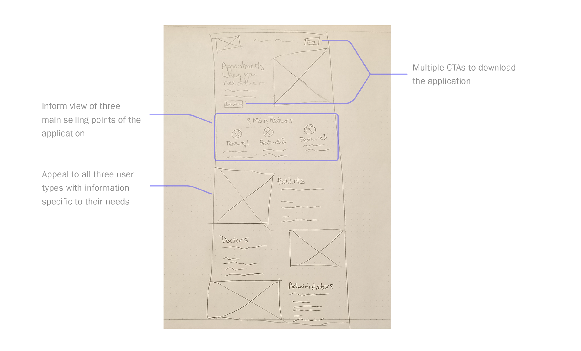
Web Screen #2
Landing Page Design
The design of the landing page has three purposes:
1. Inform all three users about what the app offers
2. Highlight the main features of the app
3. Get user to download the app
With its clean look and attractive colour the landing page design creates an approachable, but informative introduction to the application.
Thank you! 🙏
This was a fun challenge and even though I spent more time than I should have, it was totally worth it for the final result. I'd love to get your feedback on things I could improve on or have done differently.
Thank you for taking the time to read through the entire article, I’m incredibly excited to have the opportunity to be considered for this position.