Exuberance and Intrigue
The Opportunity
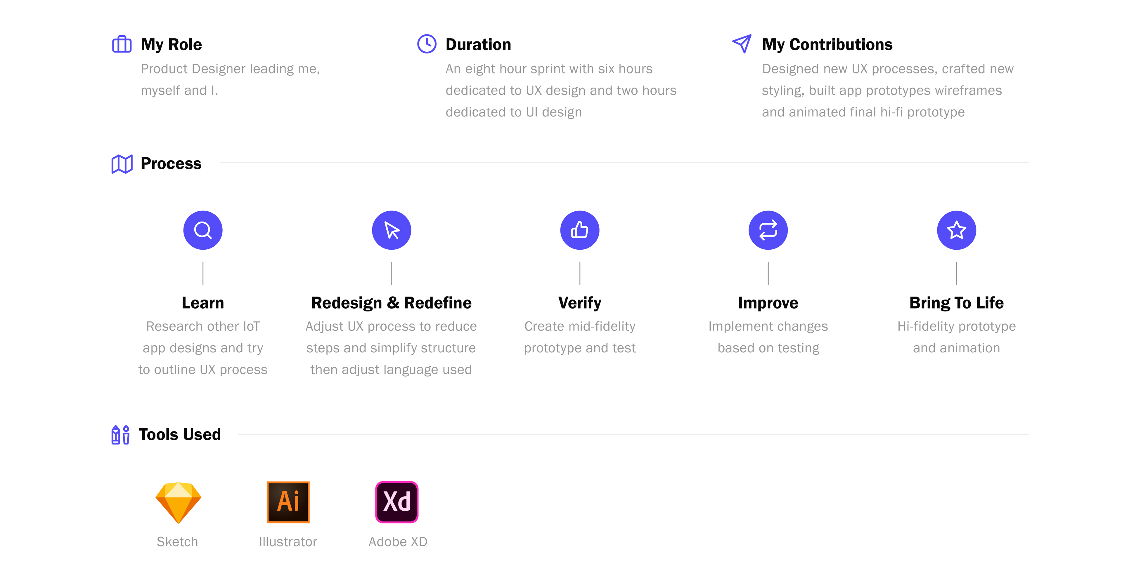
A few days ago I was delighted to receive an email from Finger Food Advanced Technology Group located in beautiful Port Coquitlam, BC. The email was in response to my application for a Junior UX/UI Designer position.
Elated and heart racing, I opened the email to find a design challenge as the next step to proving myself an ideal candidate for the position.
Turning a Mess into an Experience
The Design Challenge
Attached to the email was a Sketch file and PDF version of the Sketch file. Inside the files lay four simple mid-fidelity screens. Seemingly harmless, but upon closer inspection, broken almost beyond repair.
There were instructions provided to help understand the user flow, but they little to ease the tidal wave of questions that were forming in my mind. What I did know was that the app would be used as a platform for IoT Devices (eg. wireless security cameras) and the challenge would be to:
Provide and communicate the simplest and most efficient way for users to interact with the app when changing applicable settings for each device
Starting to Unravel the Mystery
Lo-fidelity sketching to Mid-Fidelity Screen
I started my quest for answers by taking pen to paper and trying to map out a user flow using the screens provided that kind of made sense in my mind. I supplemented these sketches with looks through Dribbble, Behance and the downloading of apps like Nest, Philips Hue and Telus Smart Home. Through my searches I was able to get a better understanding of what a typical user experience on a similar app might look like.
When I thought of a typical user experience I thought this app would probably be more of a "set it and forget it" kind of experience so I set out to design an experience that was focused on simplicity. The design would have minimal 'fluff' and focus on helping the user get set up and on their way to more interesting things as soon as possible.
Sorting Out the Modes
Screen #1
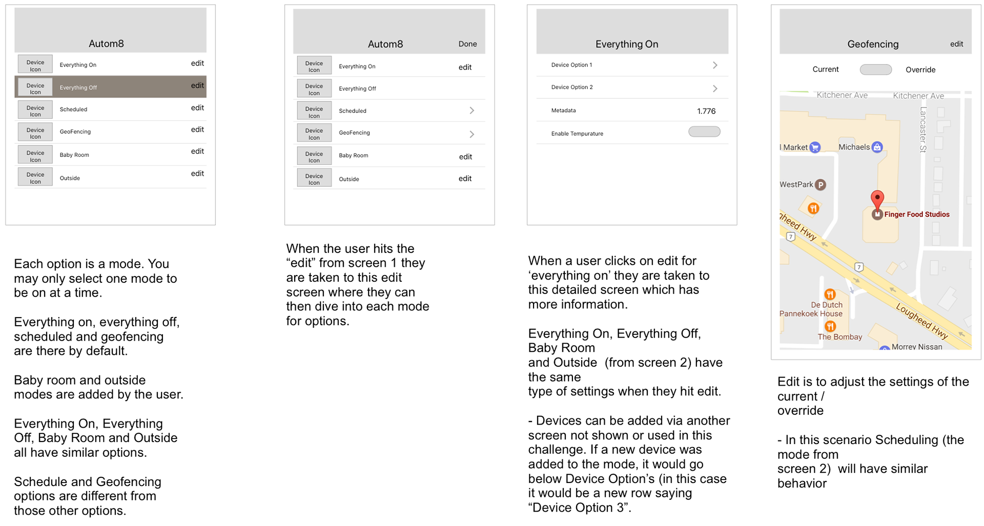
The first screen presented a number of options/modes that were simply grouped together as if they all belonged together and had the same functionality. This was a really confusing way of presenting the information so I looked for a more sensible way to group each mode.
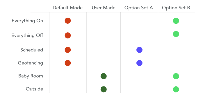
With this table it was easy to see there could be a simple categorization of the modes to User Made Modes vs Default Modes. Coupled with the requirement that only one mode could be active at one time, the following were the first iterations of screen 1.
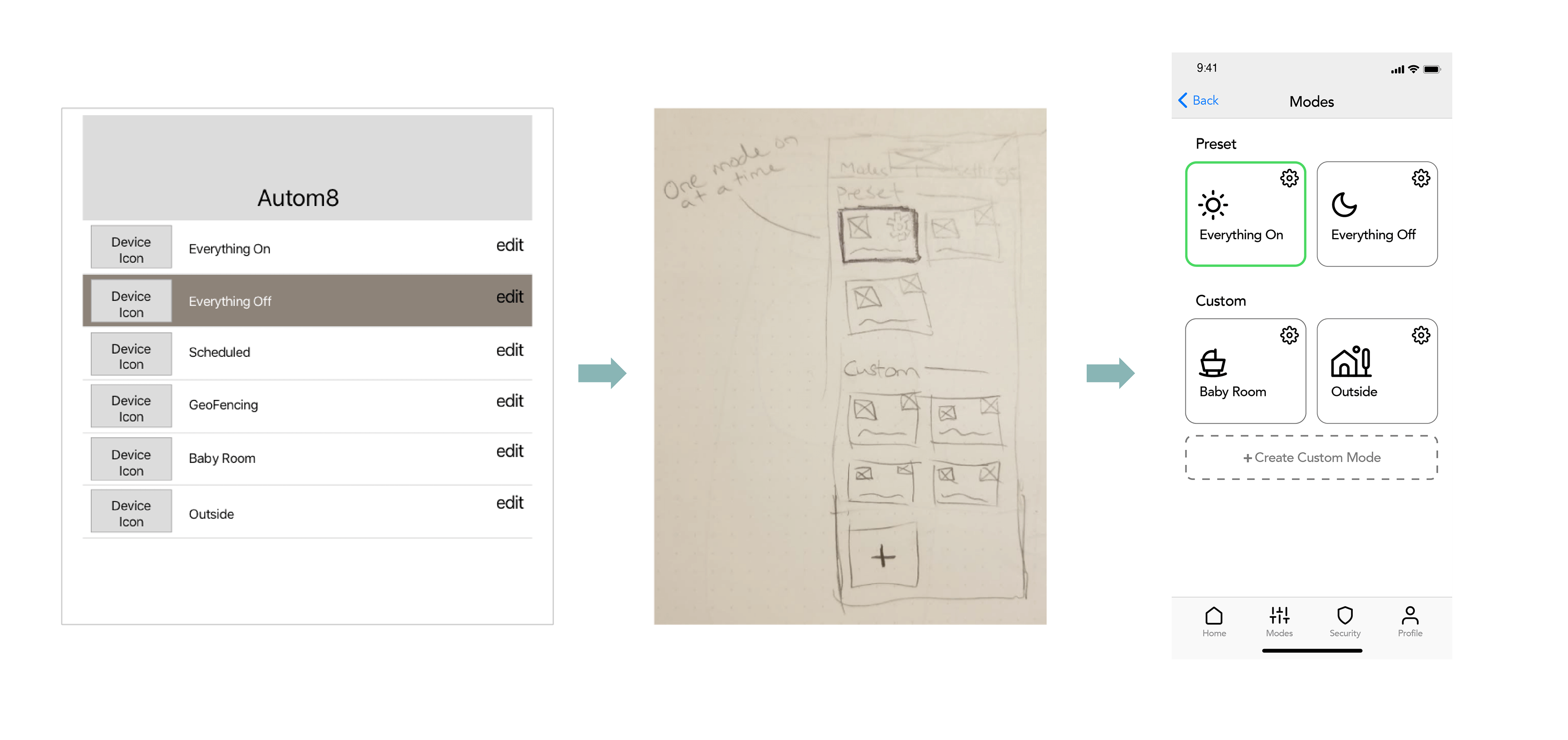
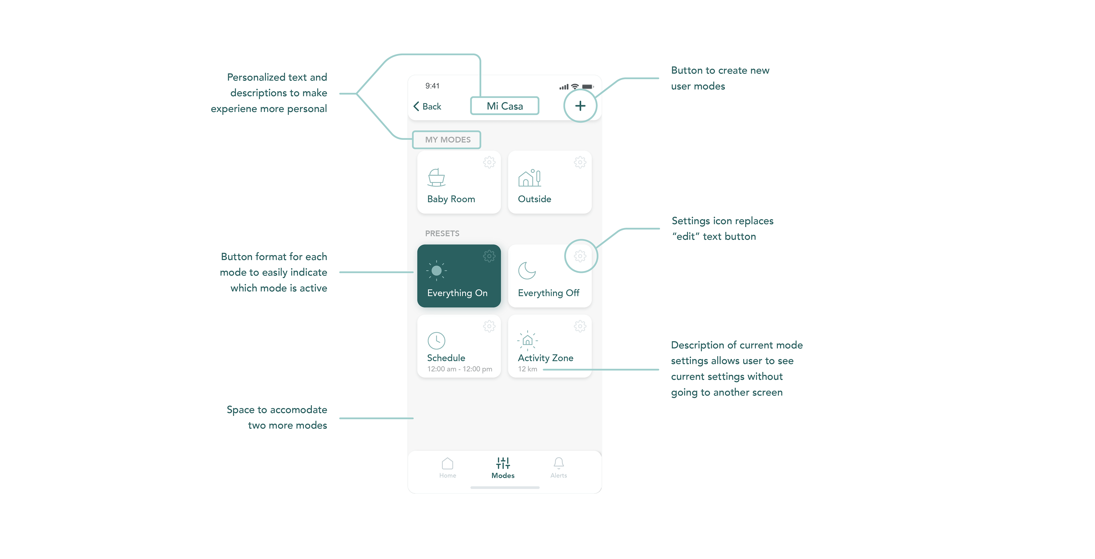
Searching through a number of different modes would be a lot easier since there would be more structure and organization. Each mode would be formatted as a button so that it would be immediately apparent which mode was currently active.
Similar to the way the starting screen was created, there would be an edit button on each mode, but this would be represented by an icon instead of text. This "settings icon" would be a friendlier and more sensible way to indicate that a user could edit/make adjustments to the mode rather than having six 'edit buttons'.
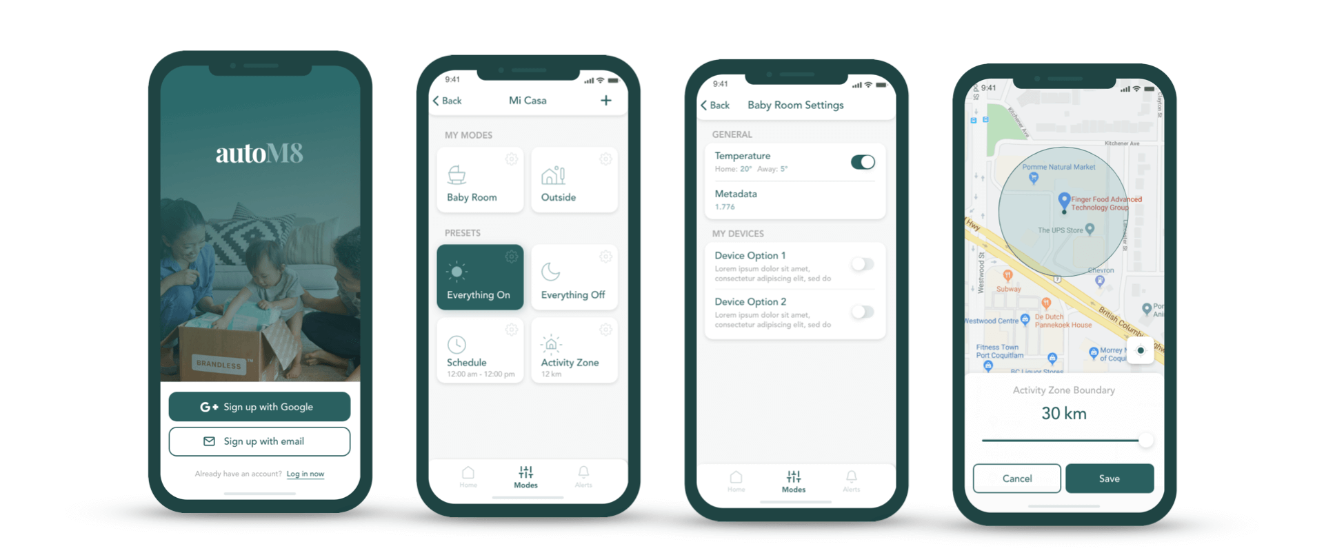
One change I made from mid-fidelity to hi-fidelity was putting the user's custom modes above the preset modes. My thought behind this was that if a user was going to take the time to set up a custom mode that should have more prominence than a default setting.
Playing With the Settings
Screen #2
The second and third screen provided in the briefing were easily the most confusing to understand. The reasons for this were that there were a number of unnecessary steps and status changes required to get to the required screen.
By having the "settings" icon inside each button I'd require less screens and be able to speed up the user's journey to the screen they were looking for.
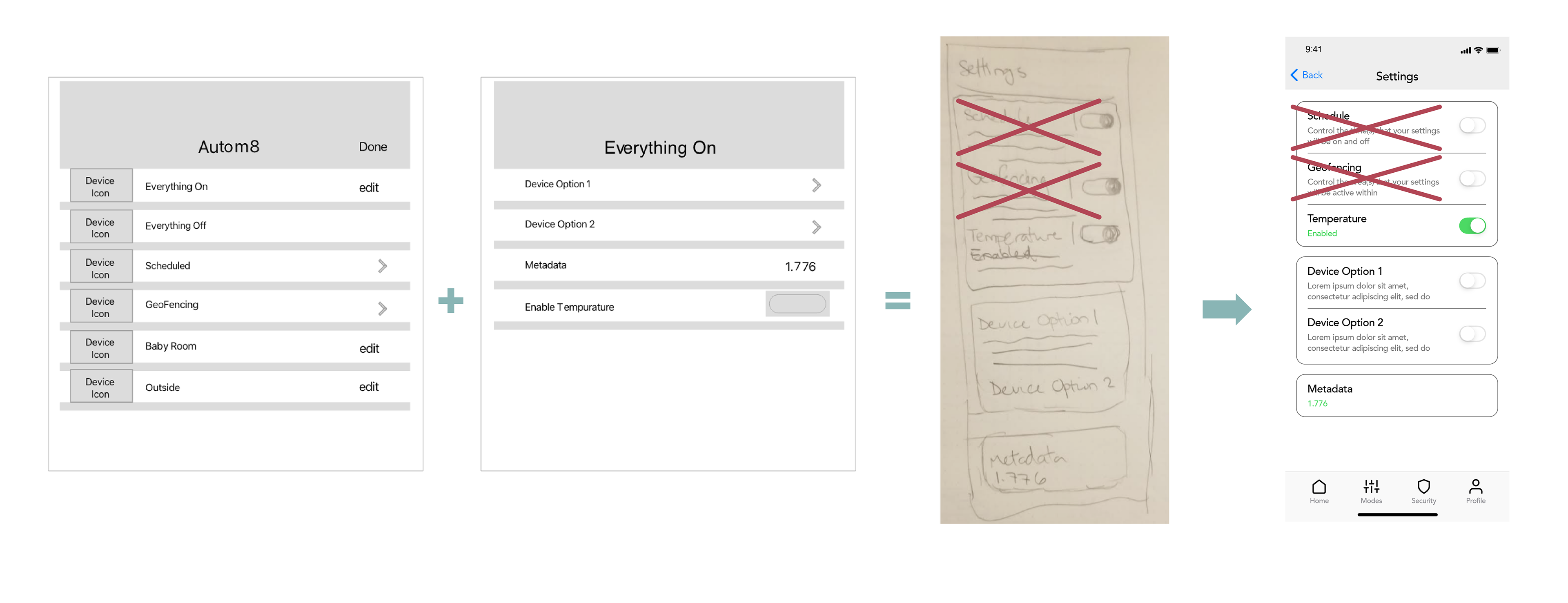
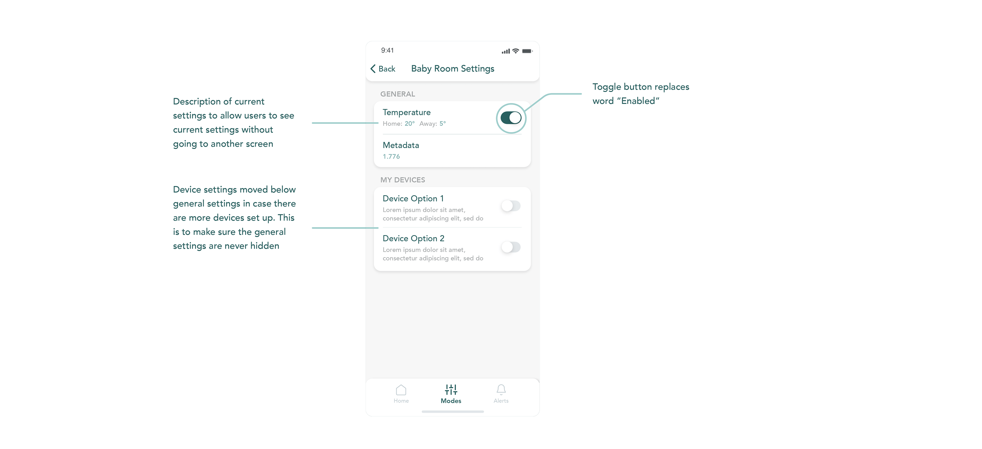
While the structure from the original screens to the mid-fidelity screen was similar, I was able to categorize each setting so that it wasn't just a long list of settings.
I also made a mistake in my drawings and mid-fidelity that I didn't realize until I was preparing the hi-fidelity version of the screen.
For some reason I thought that the Geofence and Schedule modes were settings within each mode. Upon closer review of the brief, I confirmed this was incorrect and was able to adjust the hi-fidelity version accordingly.
Setting Boundaries
Screen #3
The final screen was by far the easiest to make sense of and, again, the updated structure of the first screen allowed the user to directly access the settings of the mode they wanted to get to with just one click.
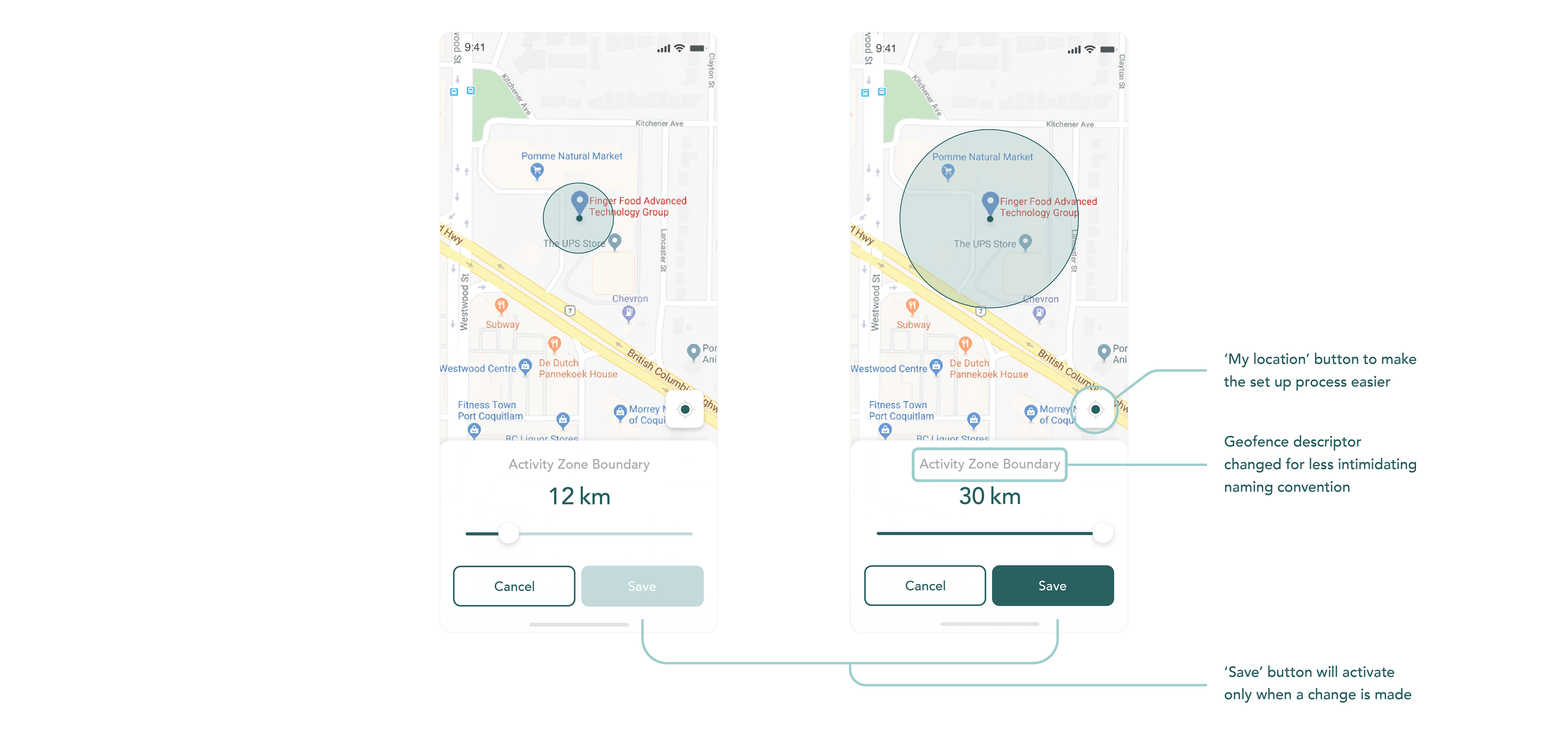
Once the user was in the settings page I wanted to make extremely simple and obvious how the user could adjust the boundary. By including a large slider it was immediately apparent how to adjust the boundary. This was paired with a couple buttons to make the options very limited.
Even now I'm not quite sure what the purpose of the toggle between 'current' and 'override' was, but I was able to create a more understandable version of that toggle in the mid-fidelity screen.
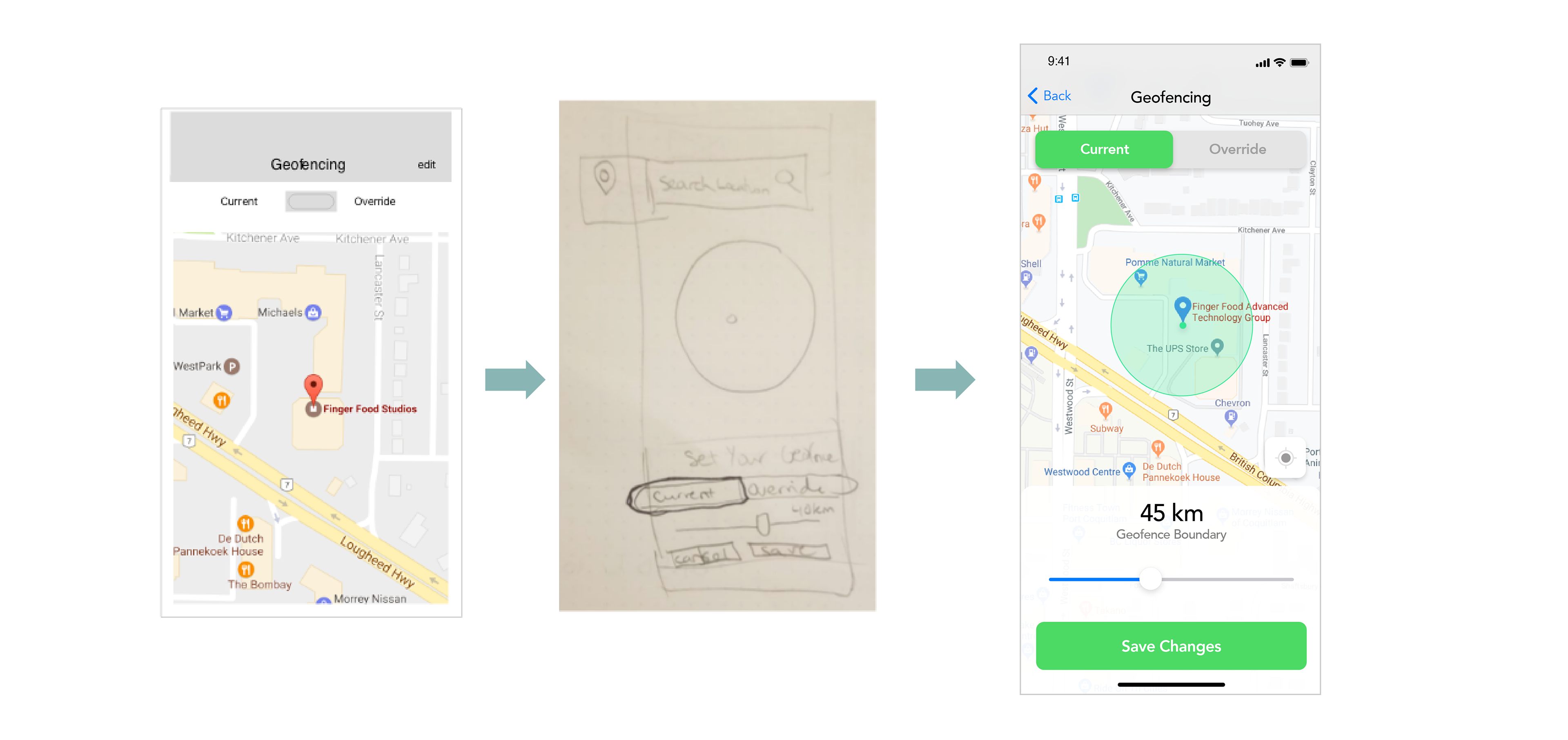
To make life easier for the user I removed the 'edit' button and designed a user flow so that when a change is made it will trigger the 'save' button to activate to indicate that a change has been made and can be saved if acceptable.
In the final hi-fidelity I also removed the current / override toggle since I couldn't figure out what the heck it would be for. In my ruminating I thought it could stand for 'Home' vs, 'Away', but ended up just removing the toggle altogether.
Making Things Easy On The Eyes
UI Design
The colour palette I chose for the hi-fidelity of the prototype was extremely minimal and easy on the eyes. I wanted to make the experience a very un-intimidating one. Adjusting settings can sometimes be a tedious and intimidating process and I wanted the colours and text choices to quell any fears that it was a complicated process.
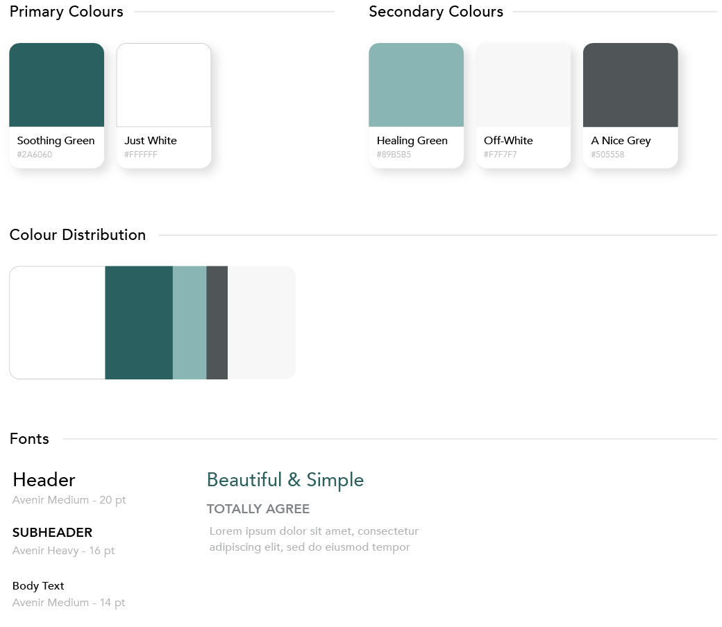
Avenir was the ideal choice since it has a very approachable look and it fit nicely with the main green colours that were also inviting and approachable. The colour 'A Nice Grey' was used throughout the final design in varying opacities for the body text and sub-headers to create a consistent and appealing look.
Bringing the Design to Life
Animating the Prototype
The final step was animating some of the interactions that a user may experience. I really enjoy animating the final prototype since it's a significantly better indication of how the user flows would work and it's simpler to make than typing a step-by-step explanation.
Bringing it all Together
Summary of Final Results
After everything was said and done, there was a drastic improvement in the UX of the app by simplifying the overall structure, creating more common usage patterns and removing unnecessary/confusing steps.
Each of the screens was optimized to make it immediately obvious what a user could do on the screen and it was all tied together with a succinct user flow. There were also a few design considerations made that would help the user make a decision without needing to enter into another screen to find information.
Next, the vernacular used in the app was re-vamped in certain places to make it more understandable and personalized. After that, the colours and font choices were leveraged to make it a simple and un-intimidating process for the user.
Thank you! 🙏
This was a fun challenge and even though I spent more time than I should have, it was totally worth it for the final result. I'd love to get your feedback on things I could improve on or have done differently.
Thank you for taking the time to read through the entire writeup, I’m incredibly excited to have the opportunity to be considered for this position.