
Aldo Silva CultureLike CEO/Founder
CultureLike
Company culture on autopilot
For this opportunity our team worked with CultureLike, in particular, the CEO/Founder Aldo Silva. Aldo's startup was on a mission to empower employees with the ability to create the culture they want.
To accomplish this he had created an app that integrated with Slack and automated the trickiest parts of building a rockstar culture.
Our Challenge
A Slack-integrated app to find, coordinate and report on culture-building activities in the workplace has already been built
How might we build an accompanying dashboard to control, report and summarize the results of the app's endeavours?
Building on a successful integration
An accompanying dashboard for a slack app
Since Aldo already had the app in beta testing our team would create the back-end dashboard for the Slack-integrated app. Our dashboard would give staff tasked with culture-building the ability to see and control the results of the app's planning, polling and surveying.
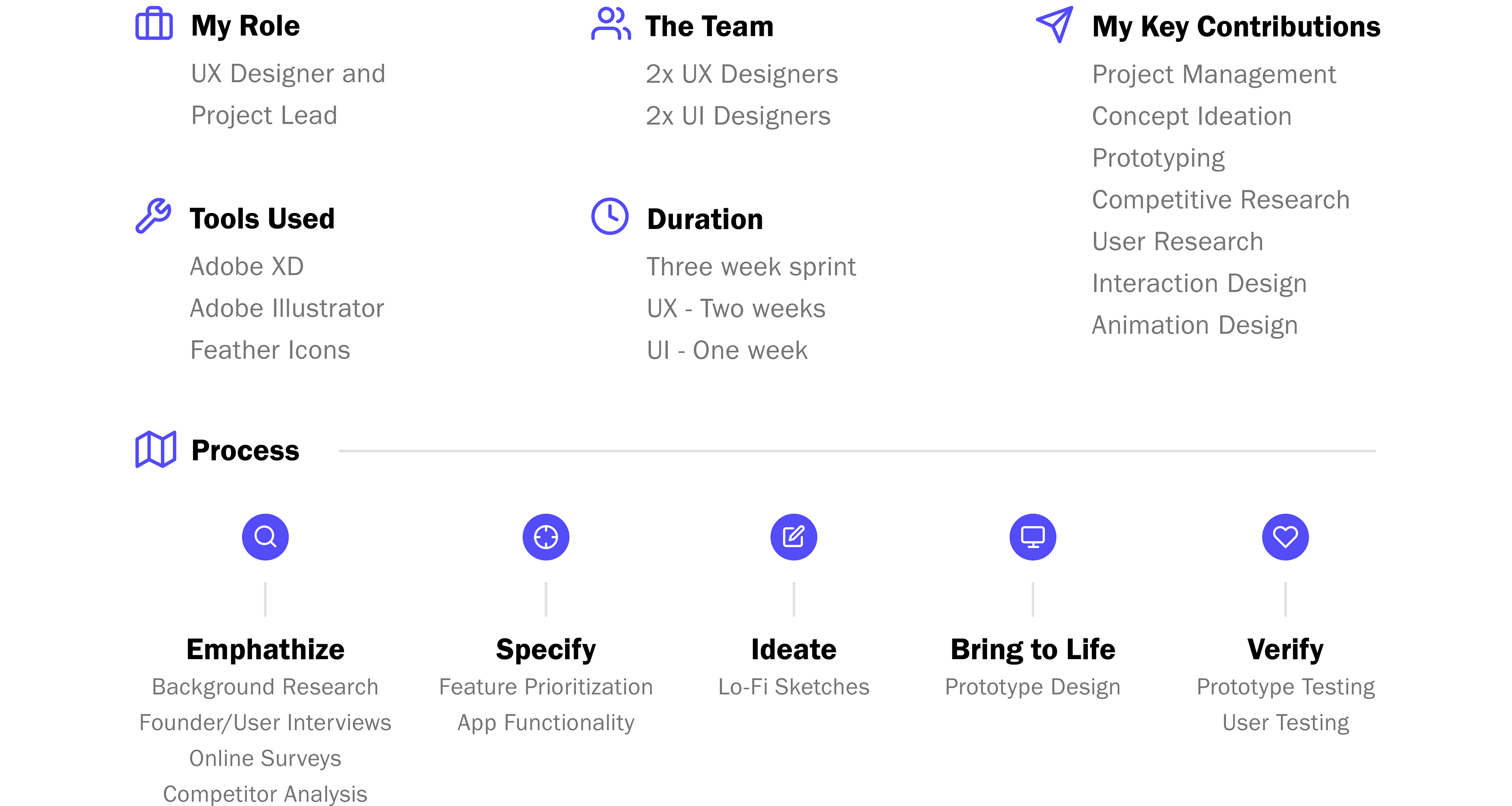
After speaking with Aldo it was quickly apparent that we'd need to create two separate dashboards. My UX partner and I decided to tackle one dashboard each. I would take on the dashboard to be used by HR staff and my partner would work on the dashboard for contractors that would be hired by HR staff
Seemingly simple, but ambitious
Project goals
With the dashboard I'd create, the goals revolved around the person who would be organizing the activities. Most likely a member of the Human Resource team.
Goal #1: Create and coordinate events with feedback from staff
Goal #2: Find professionals needed to host culture-building activities
Goal #3: Report on event success/feedback from staff
Goal #4: Slack app functions can be completed in the dashboard
Learning about our users
Key insights from user research
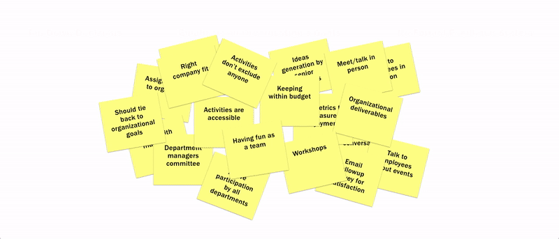
To learn about the lucky individuals tasked with building the culture of their workplace I sent a survey to a targeted set of contacts that were in HR roles. I then took the responses through a card sorting exercise to find common themes amongst the respondents.
Insight #1
Top-down decisions
Companies from respondents have a very top-down approach for culture-building activity selection. Typically, team members in management roles decide on the activity and share it with the team.
Result: The app allowed teams to vote on their activities so the dashboard would need to collate and highlight activities staff preferred the most.
Insight #2
Company goals > Staff wants
Activities were typically chosen based on their alignment to company goals rather than what the team members would prefer.
Result: HR staff would need the ability to suggest/add activities that team members could consider along with the activities that the team members suggested.
Insight #3
What feedback system?
Team members had no formal systems in place to provide feedback on activities that they liked or had participated in previously.
Result: The app had functionality built into it for team members to rate the activities. As a result, the dashboard would highlight popular activities and contractors as rated by participants.
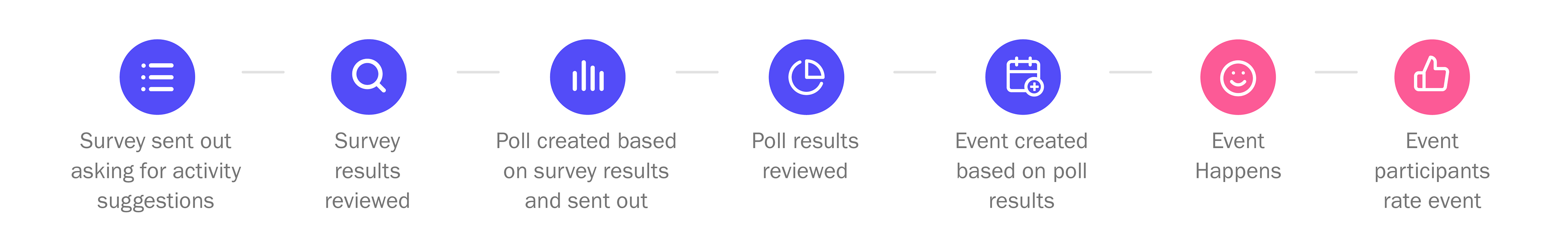
From findings to features
Syncing app and dashboard functionality
For the final piece of the research phase I wanted to define how the process for creating an event would work from the viewpoint of the event organizer.
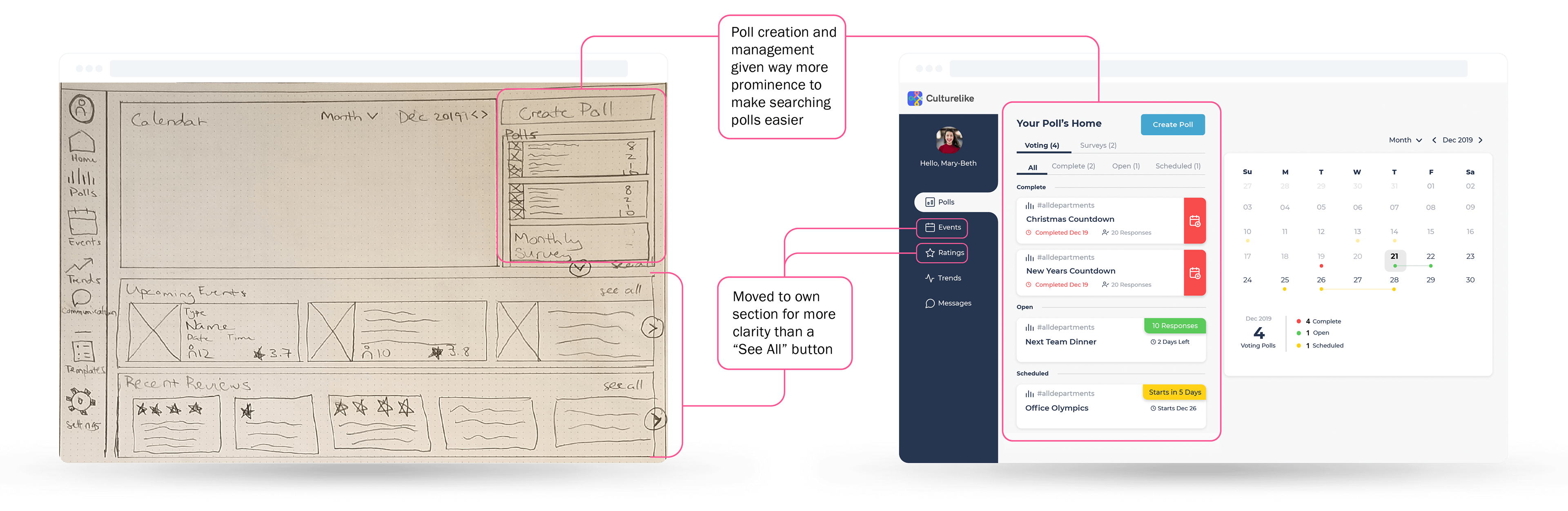
Turning scribbles to prototypes
Constructing the solution
With all my research and conclusions in mind, I started building the dashboard. Starting with some rough sketches on paper, I drew up some ideas on the whiteboard, sought feedback from my teammates and then brought the final ideations to life in Adobe XD.
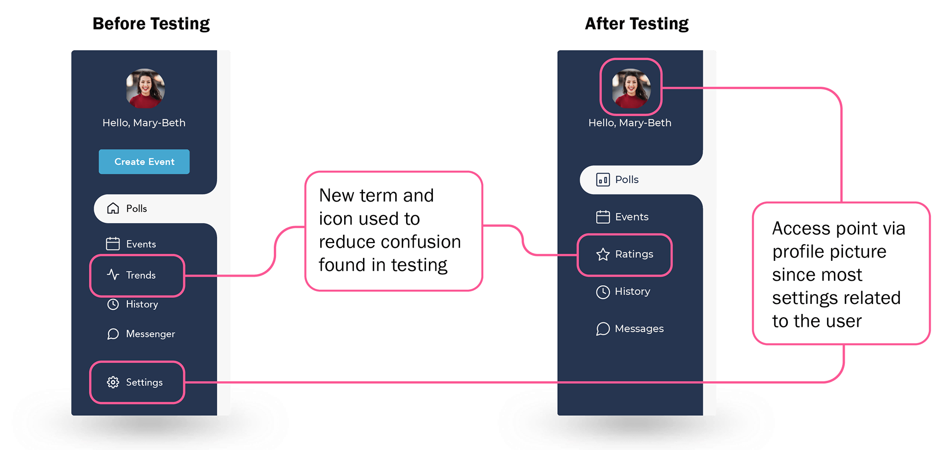
Does it actually work?
User testing
I conducted five user testing sessions from the activity organizer's perspective as well as tree testing to ensure that the information architecture of the HR Dashboard made sense.
Change #1
Refined labels
From the information architecture survey, 80% of testers would search through other tabs before selecting the right one when asked to "view feedback about an activity" or "adjust their profile settings".
After refining the labels, the correct tab was more obvious.
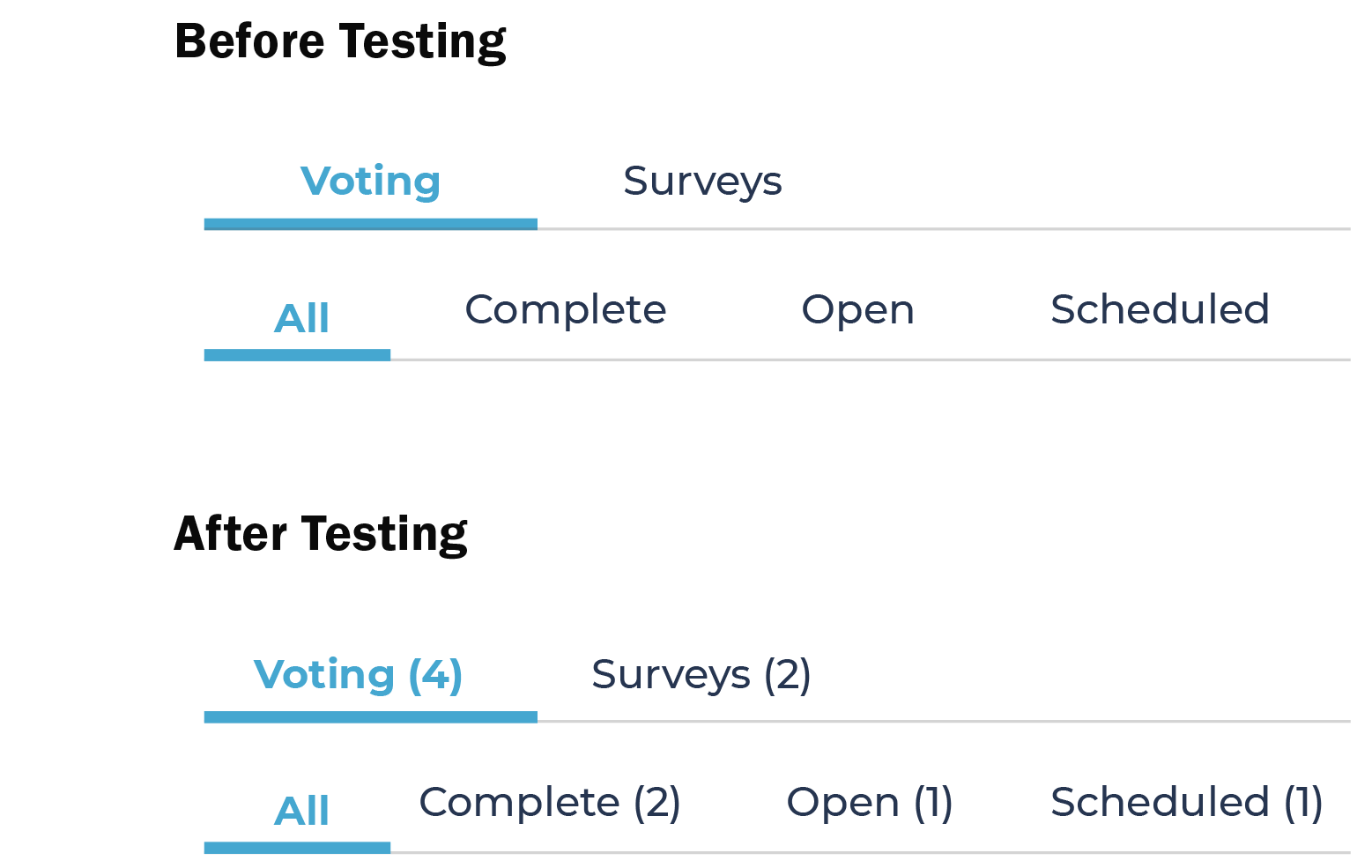
Change #2
Adding better clues
Numbers were added into the titles of the filters so that it would be easy to see if there was an item that required attention rather than a user having to click through all the tabs to see if there was something in there for them.
Now that it works, make it smaller
Building the mobile solution
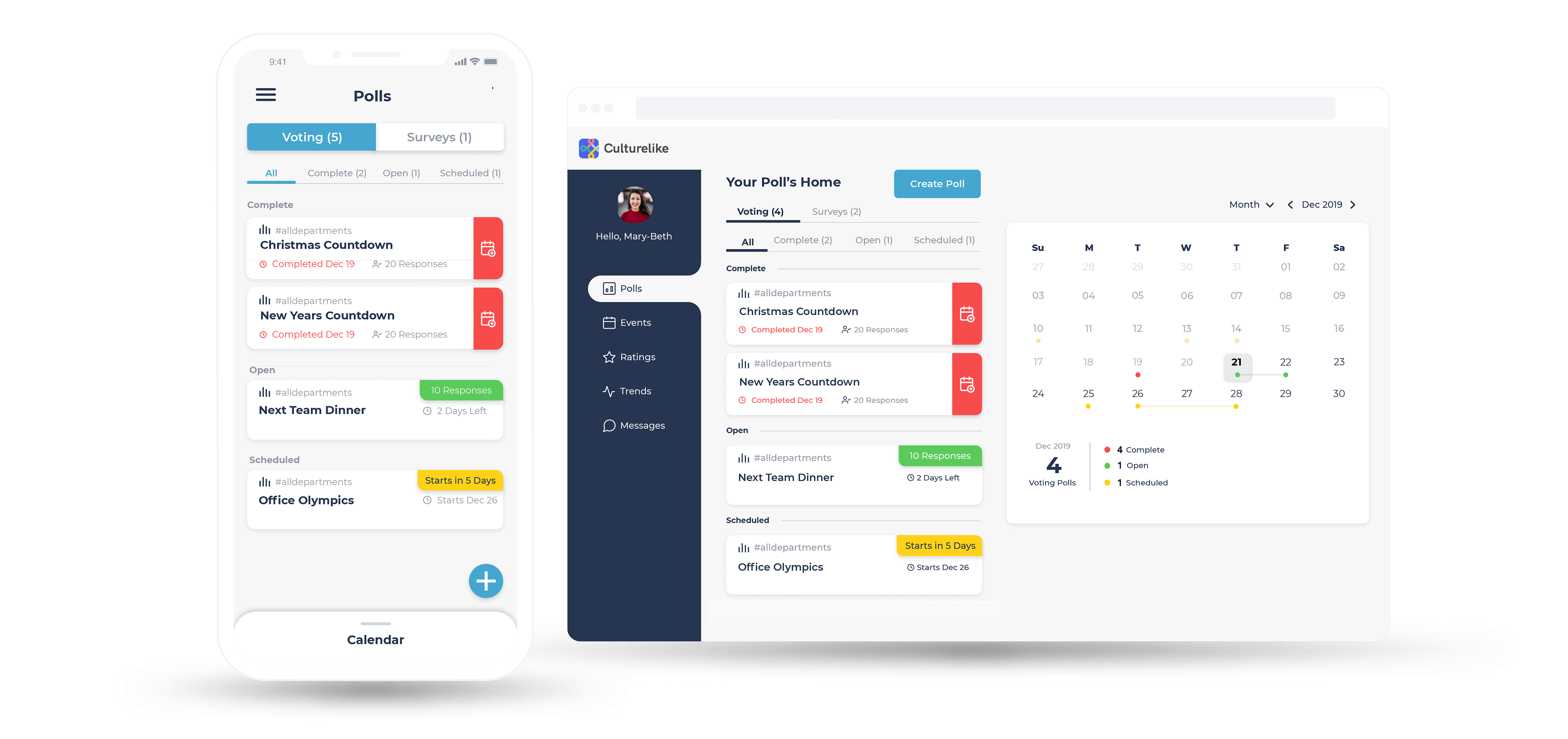
A central task for this project was to create a design that also worked for mobile devices. Thankfully, I had made the cards stackable which allowed me to build the exact same functionality of the dashboard into the mobile version.
Getting closer to reality
Interaction design
After the UI team updated the mid-fidelity prototype I animated the prototype so that it was a closer reflection of how our users would be interacting with the app.
Getting started
Clear and simple onboarding
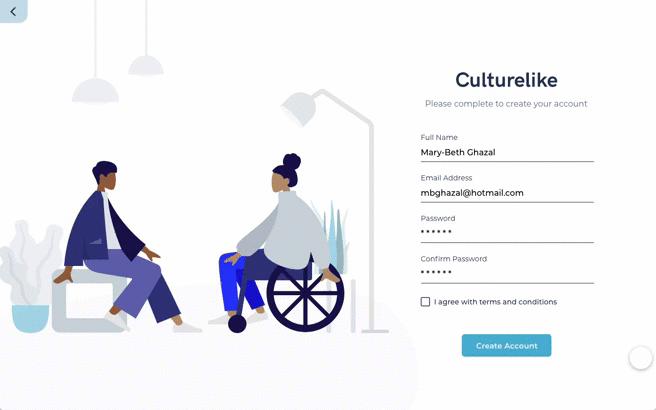
New dashboards can be intimidating so I built this onboarding experience to focus on giving the user a high-level overview of the functionality and then connecting the dashboard with Slack.
Survey & poll creation
Learning what staff want
Two types of initial polling options were created to gather information about what activities staff prefer and are available for. Surveys gauge a team's availability and their ideas for activities. Voting polls help determine the staff's preferred activities.
To make the distinction clearer, separate flows were created for the two options, but both had the same starting point.
Viewing details
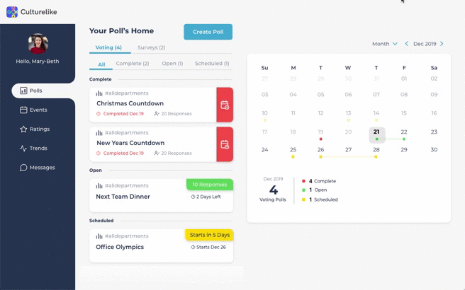
Same page overlays
An overlay was used to show the details of any card that was selected. I chose this method so that navigation was simpler and users would not need to navigate very far to find the information they needed.
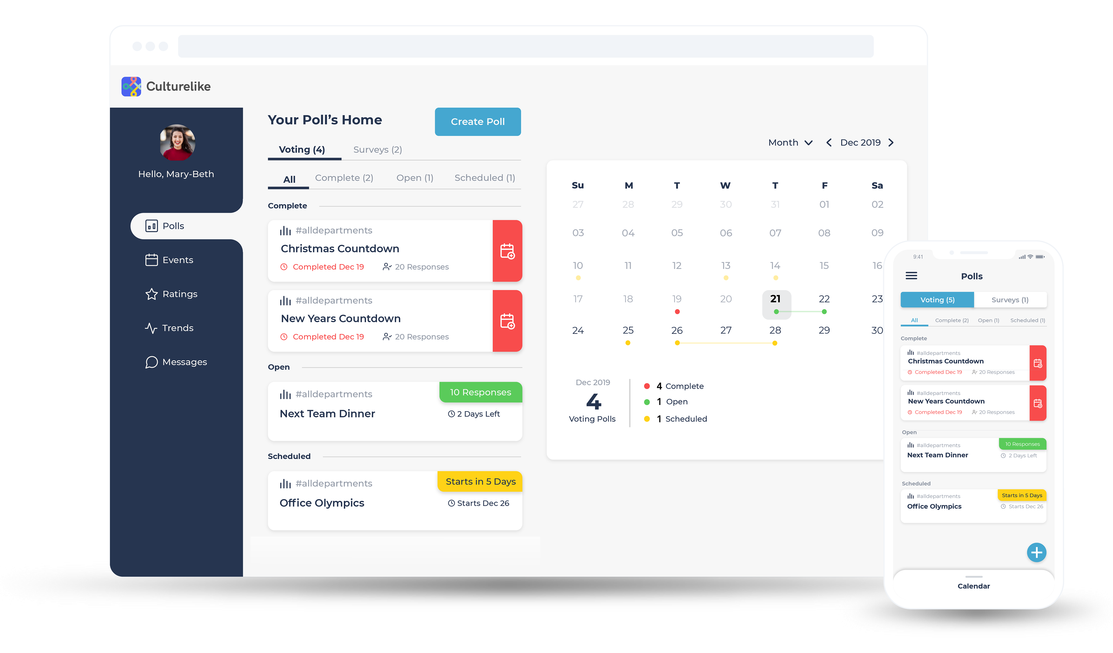
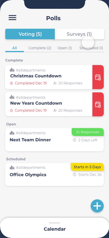
Mobile viewing
Small, but still powerful
The navigation bar in the desktop version is tucked neatly away while the calendar is hidden away at the bottom of the mobile screen as a separate card. As a result, everything is still accessible, no functionality is lost, and the organizer isn't overwhelmed with information all over the screen.
Ideal for busy professionals on the go!
Final thoughts
An exceptional specimen
In the end, the team was extremely proud of the two separate dashboards we'd created (70+ screens) and how far we'd come in just three weeks. With another two weeks to refine some of the user flows further it could have been a really exceptional prototype. Aldo was very pleased with the end result and was enthusiastic about seeing a product he'd been imagining brought to life.

"Thank you guys for all your hard work. I'm excited to show your work to the team and my mentors for their thoughts."
Aldo Silva, CEO/Founder
Feedback on the design? Want to chat over coffee about building a dashboard from scratch? Feel free to get in touch or schedule a chat.