The Opportunity
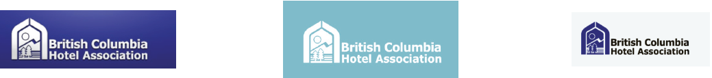
With their 100th anniversary less than two months away, the Association's Manager of Communications reached out to me to re-design their logo. Their old logo was more reminiscent of a campground and the Association was highly motivated to present a fresh look at their anniversary celebration.
Getting Aligned In The Right Direction
Project Goals
After researching and interviewing various stakeholders the task was clear. The new mark would be professional, modern, geometric and sophisticated. Other designers had been contracted and had used mountains to symbolize British Columbia and the Manager of Communication indicated this was an ideal direction to work towards.
Iterating On The Direction
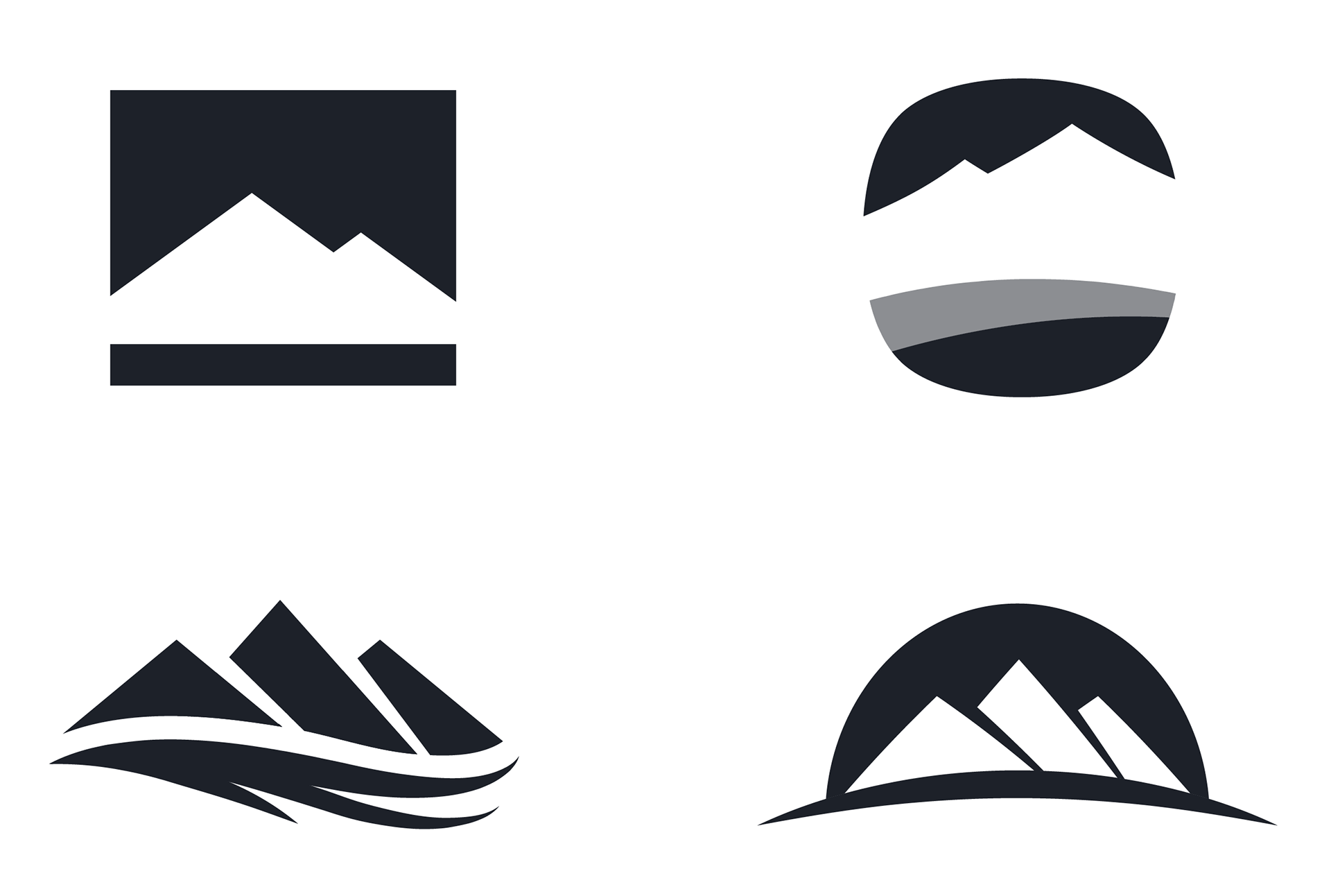
First Drafts
Two rounds of refinements with the input from the Manager of Communications resulted in four logos for the Association's executive board to consider.
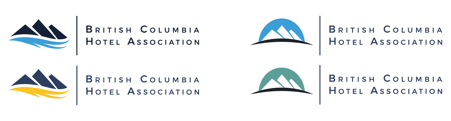
The Association's executive board selected two of these logos that would move on to the next step of adding type and colour. Two rounds of revisions with the Manager of Communications resulted in the following directions that the board had to choose from.
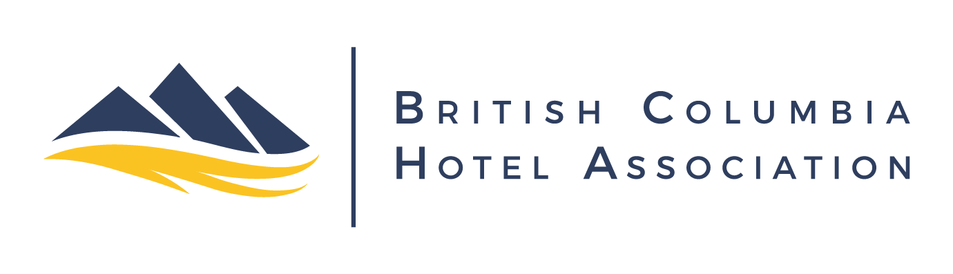
Hitting The Mark
The Final Decision
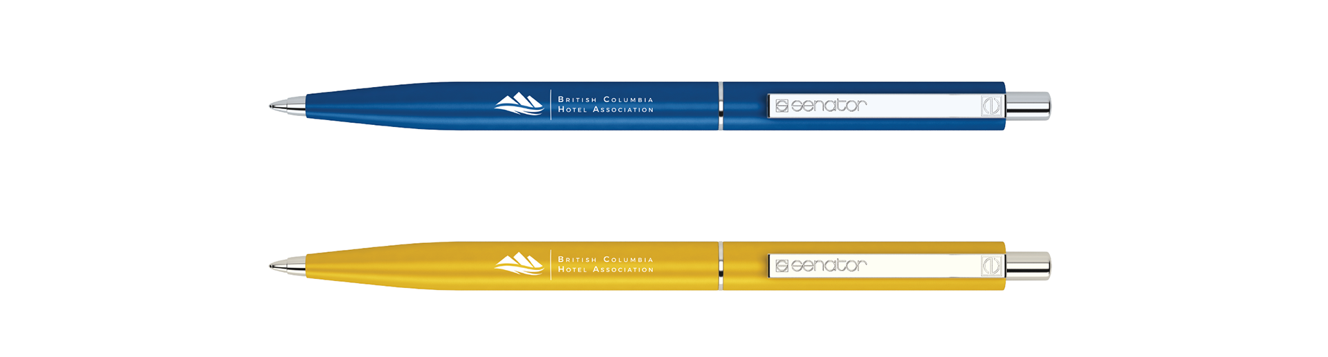
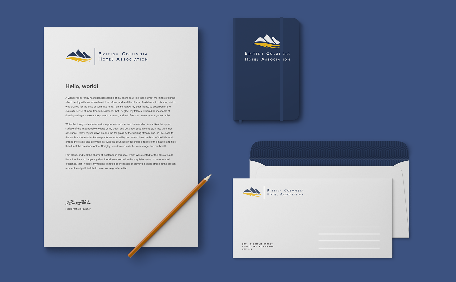
After seeing a few mockups of the two directions the Association unanimously selected the logo below as their new identity.